Practical Sales Training™ > How To Keep Your Clients Happy > Highlight the Saving

Highlight the Saving
Most businesses show the price. Fewer show the saving. But the saving is often the more powerful number. It’s the one that makes the buyer feel like they’ve won something.
Telling someone a product costs £49 is neutral. Telling them they’re saving £20 on that product is a reward. The price is the same. But the second version activates a different part of how buyers think. So it converts better.
It’s a small change to how you present a number. But because it speaks directly to how buyers weigh value, the impact on conversion can be significant.
What Is Highlight the Saving?
Highlight the Saving is a sales technique where the amount of money saved is made visible at the point of purchase or decision. Instead of showing only the price, you also show what the buyer is keeping in their pocket.
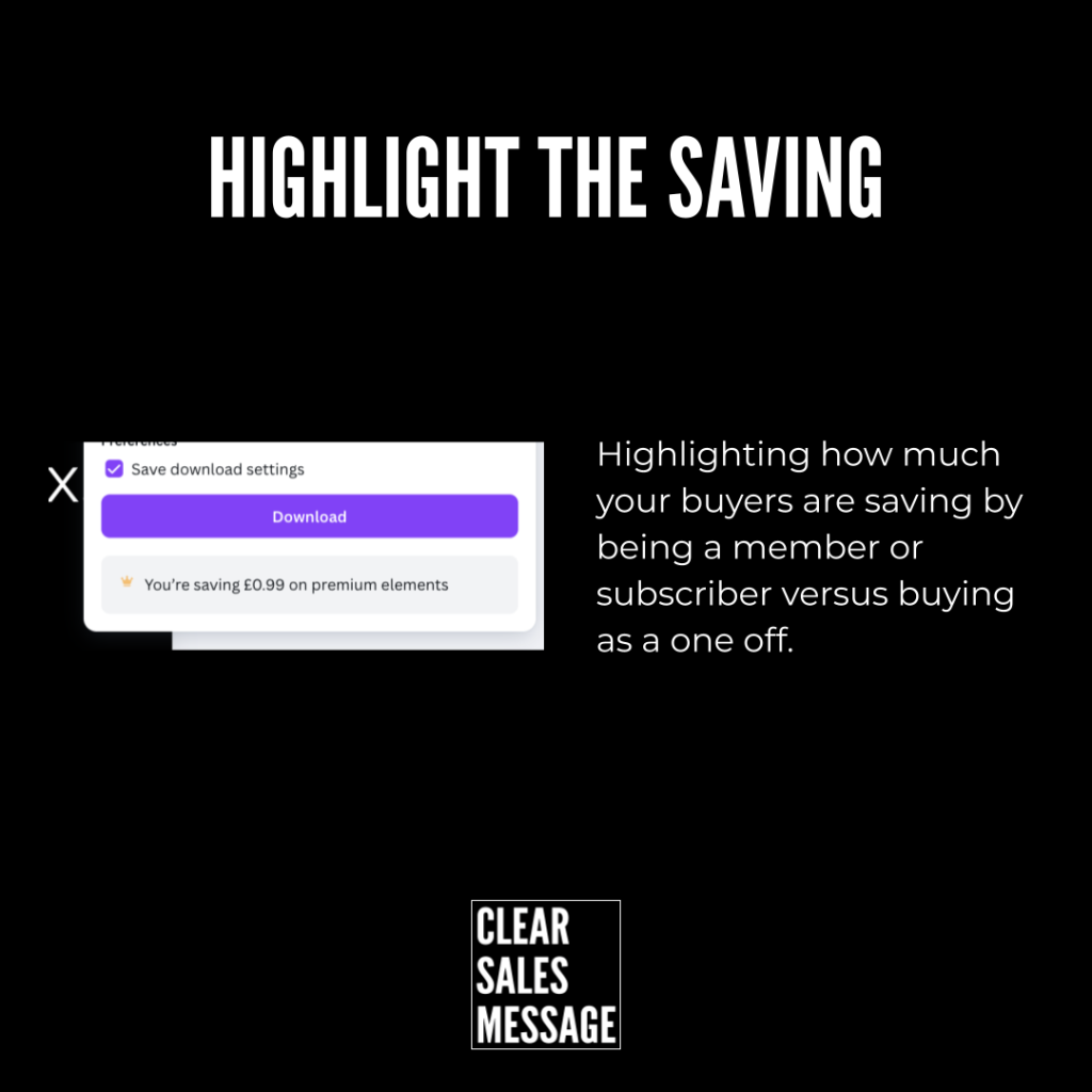
In the Canva example, the message reads “You’re saving £0.99 on premium elements.” It appears right next to the download button, at the exact moment the buyer is about to act. The saving is small. But the effect is significant because it reframes the transaction as a gain rather than a cost.
The same principle applies at any price point. Whether the saving is 99p or £999, making it visible changes how the buyer feels about the decision. As a result, they’re more likely to follow through rather than hesitate.
Why Does Highlight the Saving Work?
It works because buyers are motivated by gain as much as by price. A discount feels stronger when the saving is spelled out clearly. Without that number, the buyer has to calculate the benefit themselves. So many simply don’t bother, and the value of the offer is lost.
There are four reasons this technique is so effective. First, it shifts focus. Instead of thinking about what they’re spending, the buyer thinks about what they’re keeping. Second, it creates satisfaction. Seeing the saving rewards the buyer instantly with visible value, which feels good before they’ve even received the product. Third, it reduces resistance. The decision starts to feel like a smart financial move rather than an expense. Fourth, it reinforces urgency. When combined with a time-limited offer, a visible saving gives buyers a concrete reason to act now rather than later.
Together, these effects make Highlight the Saving one of the simplest and highest-impact tweaks you can make to any pricing presentation.
How Can You Use Highlight the Saving In Sales?
You can apply this technique in any context where price is part of the buying decision. Here’s how it works across different situations.
E-commerce Checkouts
Show the amount saved on discounts, bundles, or subscriptions right next to the total. The checkout moment is when purchase anxiety peaks. Because showing the saving reduces that anxiety and replaces it with a sense of reward, it directly cuts cart abandonment. A simple line like “You’re saving £15 on this order” does significant work at minimal cost.
Subscription Upgrades
Highlight the monthly or yearly saving when a buyer chooses a longer plan. For example, “Pay annually and save £48” is more compelling than simply showing the annual price. Because the saving is explicit, the buyer doesn’t have to calculate it. So the value of the longer commitment lands immediately rather than requiring effort to see.
Retail Offers
Add clear signage like “Save £50 today” alongside the sale price. A percentage reduction requires mental maths. A cash saving doesn’t. So displaying the saving in real money terms makes the offer feel more tangible and more immediate. As a result, it performs better than a percentage discount at the same value.
Service Proposals
Show the cost difference compared to alternatives or competitors. If a buyer can see that choosing you saves them £2,000 a year against their current supplier, that saving becomes part of the case for switching. However, this only works if the comparison is honest and the numbers are easy to follow. So present it simply and let the saving speak for itself.
Marketing Campaigns
Use the saving as a headline hook. “Save 25% when you book today” or “Members save an average of £200 a year” both lead with the benefit rather than the cost. Because the saving is the most motivating part of the offer, it earns more attention when it leads. So put it first, not in small print at the bottom.
Tips for Success
Always display the saving in real money terms rather than percentages, so it feels tangible. Keep the design simple and highly visible, ideally close to the purchase button. Also, reinforce the saving at key decision points such as checkout or the summary section of a proposal. Because the closer the saving is to the action, the more directly it influences the decision.
When Highlight the Saving Works Best
It works best when the saving is large enough to feel meaningful. A £0.99 saving still works, as the Canva example shows, because it appears at the right moment. But in general, the larger the saving relative to the full price, the more impact the number has. So use it most prominently when the discount is genuinely significant.
It also works well when the buyer is comparing options. In a competitive situation, showing that your offer saves the buyer money compared to the alternative gives them a concrete reason to choose you. The saving becomes a decision-maker rather than just a nice detail. As a result, it can shift a hesitant buyer from consideration to commitment.
Similarly, it’s powerful at moments of hesitation. When a buyer stalls at the checkout or delays a response to a proposal, a visible saving gives them something to act on. It reframes the decision from “should I spend this?” to “should I miss this saving?” That shift in framing often produces a faster yes.
When Highlight the Saving Becomes Dangerous
It becomes a problem when the saving isn’t real. Inflating an original price to manufacture a larger saving is a tactic buyers recognise fast. When they catch it, the trust damage far outweighs any short-term conversion gain. So only ever highlight a saving that is genuine and defensible.
It can also backfire when the saving is so small it feels patronising. Telling a buyer they’re saving 3p on a £200 purchase draws attention to a number that’s too small to matter. So match the prominence of the saving to its actual significance. Because a visible saving that feels trivial can make the whole offer look weak.
And it loses impact when it’s shown too early. A saving highlighted on a landing page before the buyer has decided they want the product works less well than one shown at the checkout once they’ve already committed to buying. So time the reveal carefully. The closer to the decision point, the more the saving influences the outcome.
Common Highlight the Saving Mistakes
Using Percentages Instead of Pounds
A 15% saving requires the buyer to calculate the cash value. Most won’t bother. So show the real number instead. “Save £30” is more compelling than “Save 15%” even when they represent the same amount. Because the pound figure is immediate and tangible, it lands harder and faster in the buyer’s mind.
Hiding the Saving in Small Print
If the saving is buried in footnotes or displayed in a small font, it does no conversion work. The whole point is visibility. So give it prominence. Place it close to the price, close to the button, and make it easy to read at a glance. Because a saving that buyers don’t notice might as well not exist.
Only Showing It Once
A single mention of the saving at the start of a page or proposal isn’t enough. Reinforce it at each key decision point. Show it on the product page, on the checkout summary, and in the confirmation email. However, don’t repeat it so often that it starts to feel like a hard sell. Each reinforcement should feel natural and relevant to the moment.
Inventing the Original Price
Inflating a was-price to create the appearance of a large saving is one of the most commonly spotted pricing tricks. Buyers are increasingly savvy about this. When they catch it, they lose trust in the whole offer. So always use a genuine reference price. The saving only works as a conversion tool when the buyer believes it.
Highlight the Saving – An Example
Canva uses this technique at the point of download. When a user downloads a design that includes a premium element, a small notification appears next to the download button. It reads: “You’re saving £0.99 on premium elements.” The saving is small. But the timing is perfect. It appears at the exact moment the user is about to complete their action, so it reinforces the value of their membership right when they’re most likely to register it.
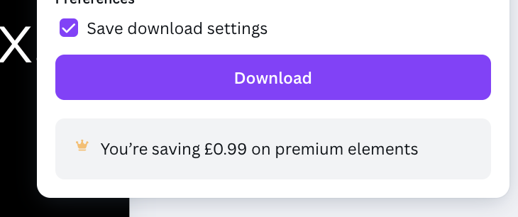
The message is small but deliberate. It doesn’t interrupt the user’s flow. Instead, it adds a moment of positive reinforcement right before they act. As a result, the user finishes the download feeling like a smart buyer rather than someone who just spent money. That feeling keeps them subscribed, coming back, and recommending the product to others. That’s Highlight the Saving working at its best.
See also