

Practical Sales Training™ > How To Connect With Your Buyer > The Gruen Transfer
The Gruen Transfer
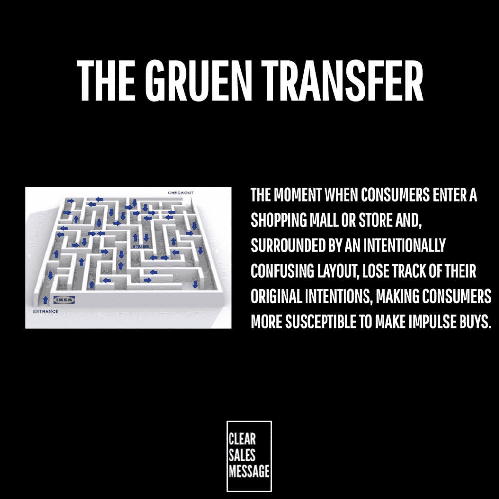
You know that IKEA feeling. You went in for a lamp. But you left with candles, a rug, and a bag of meatballs. That’s not an accident.
What Is It
The Gruen transfer is the reason IKEA is so hard to navigate. The layout deliberately confuses you. So you end up seeing far more merchandise than you planned to.
Why Does It Work
It works because you literally see more stock than you intended to. This one’s tricky though, since it can genuinely annoy buyers.
IKEA is famous for it. In fact, people even share shortcuts online to skip the maze entirely. But the layout still works, because it disorients you enough to follow one long path out. You can’t just nip in and out for one thing.
How Can You Use It
This only works in physical spaces. So a confusing website will drive visitors away fast, and you should avoid that entirely.
Curate The Physical Journey
If you have a physical space, think about the path a buyer walks. Could you shape it so they see everything on offer, without it feeling annoying or aimless?
Organise By Logical Sections
IKEA splits its maze into rooms of the home, so it still feels logical even while it confuses you. Could you organise your own space the same way, so the path feels purposeful rather than random?
When It Works Best
Bigger Spaces With More To See
This works best in larger physical spaces, since there’s genuinely more to see. A tiny shop has little room to build a meaningful detour.
Browsable Product Categories
It also works well when your stock naturally invites browsing, like homeware, garden supplies, or hobby goods. Impulse buys thrive in categories like these.
When It Becomes Dangerous
Frustration Instead Of Curiosity
This backfires if the layout feels frustrating rather than interesting. Annoyed customers don’t come back, even if they bought more that one time.
Buyers Who Are In A Hurry
It’s also risky for anyone in a rush. Some buyers just want in and out fast, so a maze layout can cost you that customer entirely.
Common Mistakes
Making It Confusing Instead Of Curated
There’s a real difference between a guided path and total chaos. So keep the layout logical, even while it takes the scenic route.
Ignoring The Customer Who’s In A Rush
Not every visitor wants to browse. So consider a faster route too, for people who already know exactly what they need.
The Gruen Transfer – An Example
A Garden Centre Redesigns Its Path
A local garden centre restructured its store layout around one winding path. Customers pass through high margin seasonal flowers first. Then garden tools. Only then do they reach the compost and plant food at the back, which is what most people actually came for.
Customers often discover something they didn’t know they wanted, like decorative pots or novelty seed kits, simply because the layout funnels them straight past it. As a result, the path maximises exposure to impulse buys, even before the customer reaches their original goal.
See also