

Practical Sales Training™ > How People Work > Price Trickery
Price Trickery
What Is It?
How you communicate a price changes how expensive it feels. The number itself never moves. Only the way it’s written does.
Why Does It Work?
It works because odd pricing and the left digit effect genuinely change how we perceive numbers. Research backs this up directly.
Consumers’ price evaluations are influenced by the left-digit bias, wherein consumers judge the difference between $4.00 and $2.99 to be larger than that between $4.01 and $3.00, even though the numeric differences are identical. Source
How Can You Use It?
You can use this to make something feel more expensive, or less expensive, purely through formatting. Playing with the currency symbol and the pennies changes how buyers perceive a price. The actual number stays exactly the same.
First, understand anchoring. The very first price your buyer sees becomes their reference point for everything that follows.
Make Things Appear More Expensive
To make something feel more expensive, strip detail away. Remove the currency symbol, so £7.00 becomes 7.00. Remove the pennies instead, so it reads as £7. Or remove both entirely, leaving just the number 7.
Make Things Appear Less Expensive
To make something feel less expensive, add detail back in. Use odd pricing, a .99 or .97 ending, so £7.97 feels smaller than a round number. Keep the currency symbol too, so it reads as £7.99 rather than a bare figure.
When It Works Best
This works best in contexts where buyers compare multiple prices side by side. Small formatting differences shape which option feels cheaper. It also helps in upmarket settings, where stripping detail signals confidence rather than cheapness.
When It Becomes Dangerous
This becomes risky if buyers feel manipulated once they notice the formatting trick. A price that feels deliberately obscured can damage trust more than the number itself.
Common Mistakes
Stripping Detail In The Wrong Context
Don’t strip pricing detail where buyers expect precision, like anything sold by weight. The wrong context makes vague pricing look evasive rather than premium.
Using It To Disguise A Bad Deal
Never rely on formatting alone to disguise a genuinely uncompetitive price. The trick shifts perception at the margins. It won’t turn a bad deal into a good one.
Price Trickery – An Example
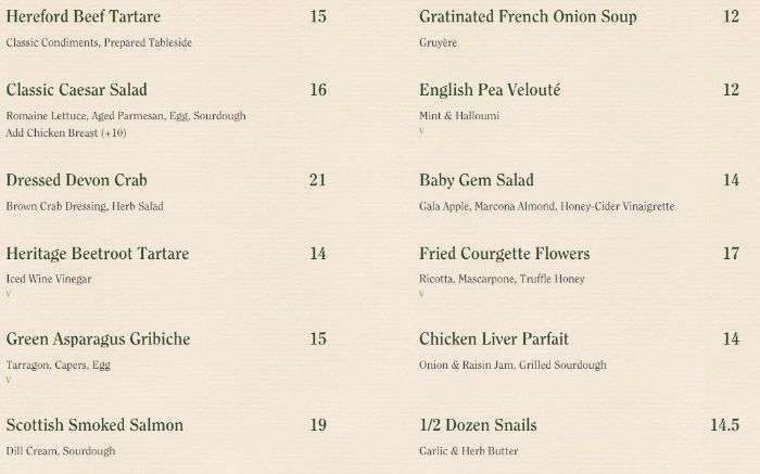
Many upmarket restaurants remove the £ sign entirely from their menus. That can make the whole experience feel more upmarket.
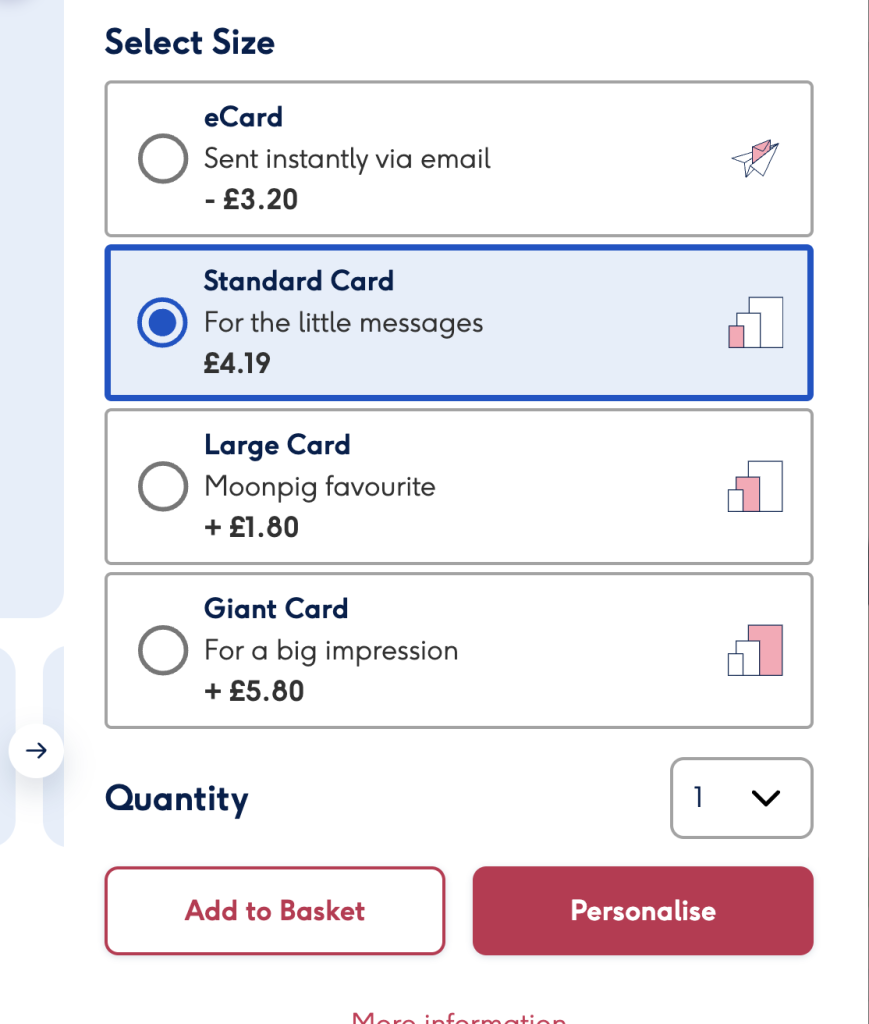
This card website focuses attention on the upgrade cost instead of the total, to make the bigger option feel cheaper. “+£1.80” doesn’t mean the card costs £1.80. It’s simply a smaller number than the £5.99 it actually costs.
See also