Practical Sales Training™ > How To Get Attention > Rebranding

Rebranding
A new logo doesn’t make a business different. It just tells people the business already changed, and asks them to believe it.
That’s rebranding. Done well, it closes the gap between what you’ve become and what your brand still looks like. Done badly, it just confuses people who already trusted the old version.
This page covers what rebranding is, why it works when it reflects reality, and why it backfires hard when it doesn’t.
What Is Rebranding?
Rebranding is the act of updating the signal your business sends to the market.
It isn’t just a new logo, colour palette, or font. It’s a deliberate shift in how your business gets perceived, so your outward message matches where the business is now, not where it started.
Rebranding exists to correct drift. When your offer evolves but your brand doesn’t, confusion creeps in. And confused buyers don’t convert. So a well-timed rebrand realigns perception, positioning, and expectation in one single move.
Why Does Rebranding Work?
Rebranding works by changing the mental shortcut buyers use to judge you. People don’t analyse brands deeply. Instead, they scan them, using visual and verbal cues to decide whether something’s relevant, modern, premium, or right for where they are now.
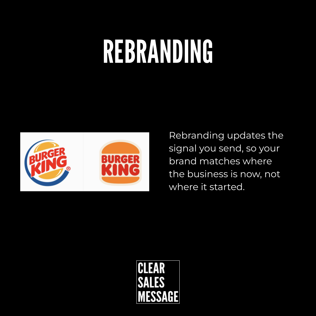
When a brand updates, it sends a clear signal: “we’ve moved on.” That’s why a company like Burger King didn’t just change its logo for the sake of looks. It simplified the design to reflect confidence, heritage, and clarity, so the brand finally matched the business it had become.
Rebranding works when it reduces the friction between what you are, and what buyers think you are.
How Can You Use Rebranding In Sales?
Know When To Consider It
Rebranding is most powerful when used on purpose, not emotionally. Consider it when your offer has improved but your brand still feels junior, when you’re attracting the wrong type of buyer, when your pricing has gone up but your brand doesn’t justify it, or when your messaging feels harder to land than it used to.
Know What It Should Achieve
Used well, rebranding resets buyer expectations before the sales conversation even starts. It also makes your message feel more credible without adding extra proof, signals progress and maturity instantly, and reduces how much you need to explain or justify your position.
Rebranding isn’t about becoming something new. It’s about catching up with what you already are.
When Rebranding Works Best
It works best when the business has genuinely outgrown its current image, so the update simply confirms a shift that’s already happened rather than announcing one that hasn’t.
It also works well alongside real, visible change elsewhere, like a new product line, a price increase, or a shift in who you’re now serving, since the rebrand then has something solid to point to.
When Rebranding Goes Wrong
Rebranding only works when it reflects reality. When it’s disconnected from how buyers already see you, it creates friction instead of clarity.
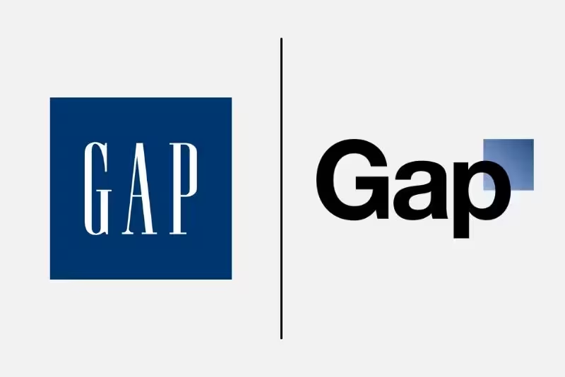
A classic example is Gap. Gap changed its logo abruptly, with no meaningful change in product, positioning, or customer experience behind it. The signal changed. The business didn’t.
Buyers didn’t feel progress. They felt confusion. The backlash wasn’t really about taste. It was about trust. The new brand didn’t match the mental model people already held, so they rejected it outright.
Bad rebranding usually happens when the brand changes before the business does, when the update is cosmetic rather than communicative, when familiarity gets removed with no clear replacement signal, or when a brand chases “modern” instead of accurate.
Rebranding isn’t about novelty. It’s about alignment. When the signal changes without substance behind it, buyers feel it instantly.
Common Rebranding Mistakes
Changing The Brand Before The Business
Updating the look before anything substantial has actually changed leaves buyers comparing a new promise against an old reality. Let the business change first, then let the brand catch up.
Chasing Modern Over Accurate
A trendy redesign that doesn’t reflect what the business genuinely is reads as style for its own sake. Aim for a brand that’s true to the business, not just current.
Removing Familiarity With No Replacement Signal
Stripping away a recognisable look without giving people something equally clear to hold onto creates pure confusion. Replace familiarity with familiarity, not with a blank space.
Rebranding – An Example
Burger King’s 2021 rebrand is a strong example of rebranding done well. The company simplified its logo back toward a retro, confident design, stripping away the busier branding it had used for years.
That update didn’t happen in isolation. It came alongside real changes in the food, the stores, and the overall brand positioning, so the new look had something genuine to back it up.
Gap sits at the opposite end. In 2010, the brand swapped its long-standing logo for a generic, modern-looking replacement, with no real shift in the product or experience behind it. The backlash was immediate, and the company reverted within days.
That’s rebranding showing both sides of the same coin. One signalled real change people could feel. The other signalled change that simply wasn’t there, and buyers noticed instantly.
See also