Practical Sales Training™ > How To Get Attention > The Preview Effect

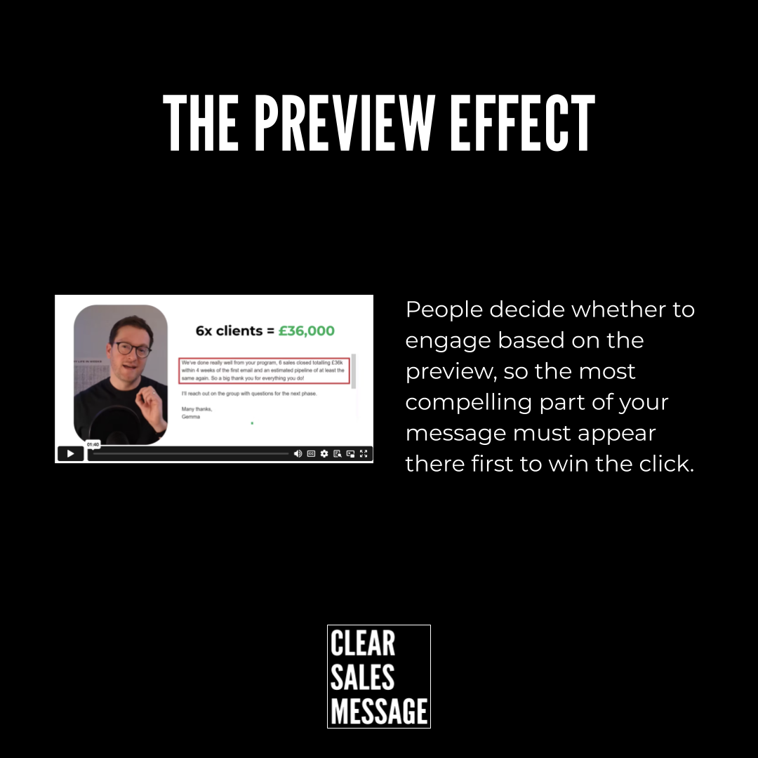
The Preview Effect
Most content never gets read. Not because it’s bad – but because the preview didn’t earn the click. The subject line got skipped. The thumbnail looked dull. The first sentence gave nothing away.
People decide fast. In fact, research shows visitors form an opinion about a webpage in as little as 50 milliseconds. So the preview isn’t just an intro. It’s the whole pitch.
Get it right and the rest of your message gets a chance. Get it wrong and nobody finds out how good the rest was.
What Is The Preview Effect?
The Preview Effect describes how people judge the value of something from its visible intro – not its full content. This preview might be an email subject line, a video thumbnail, a search result, a social caption, or an opening sentence.
In many cases, that small fragment is the only part someone sees before making a decision. So the preview becomes a proxy for the whole experience. If it looks relevant, attention continues. If it doesn’t, engagement stops before the main message ever lands.
That means the decision to engage happens before engagement itself. And that’s what most people miss when they focus on content quality alone.
Why Does The Preview Effect Work?
Attention works under pressure. People filter fast because time and mental energy run short. So the brain looks for quick signals – does this look useful? Will reading on deliver something worth the effort?
Research into online behaviour shows that users make rapid decisions about whether to engage based on what they see before clicking. Studies found that visitors form an opinion about a webpage in as little as 50 milliseconds – so initial previews strongly shape whether engagement happens at all.
Source: Google Research via Behaviour & Information Technology Journal
Strong previews cut uncertainty. They hint at a clear outcome or useful insight – so the viewer feels confident that reading on will pay off. However, when previews stay vague or generic, the effort of going further feels unnecessary. As a result, even great content gets ignored simply because its value didn’t show up soon enough.
How Can You Use The Preview Effect In Sales?
The key shift is treating previews as decision points – not decoration. Because improving the preview often lifts results without changing anything else.
Place the strongest idea first
The most compelling part of your message should appear where buyers preview it – not sit buried deeper in the content. For example, if your email contains a strong result or proof point, lead with it. Because if that insight lives on page two of a proposal nobody opened, it does no work at all.
Design for scanning behaviour
Assume people will only see a fragment of what you create. So headlines, thumbnails, summaries, and opening lines should each carry meaning on their own. Each preview should stand alone. If it only makes sense in context, it won’t work as a preview.
Match expectation with delivery
The preview should reflect what follows. When expectation and experience line up, trust grows and engagement continues. However, misleading previews may win clicks in the short term but weaken credibility fast. So be accurate. A preview that sets the right expectation always beats one that overpromises.
Optimise for each platform
Email inboxes, search results, messaging apps, and social feeds all compress content differently. So think about how your message appears in each one. A subject line gets cut off. A thumbnail shrinks. An opening sentence may be all that shows. Therefore, build your preview to survive that compression – not just to look good in full view.
Treat previews as the true start of engagement
Many people treat previews as a minor extra – something to fill in after the main content is done. But in practice, the preview is where engagement starts or stops. So give it the same care as the content itself. In fact, if you only have time to improve one thing, the preview is often the highest-value place to start.
When The Preview Effect Matters Most
It matters most in high-volume, low-attention environments. Email inboxes, LinkedIn feeds, and search results all pit your message against dozens of others at once. In those spaces, the preview does almost all the work.
It also matters most when the buyer doesn’t know you yet. A warm prospect might open your email out of familiarity. But a cold one will only open it if the subject line earns it. So for any outreach or top-of-funnel content, the preview is the most important part of the whole message.
When The Preview Effect Becomes Dangerous
It becomes dangerous when the preview outperforms what follows. A great subject line that leads to a weak email damages trust. A bold thumbnail that leads to a dull video loses subscribers. So the preview and the content need to move together – one earns the click, the other justifies it.
Similarly, optimising the preview without fixing weak content is a short-term tactic. More people open, but more people also feel let down. As a result, open rates rise while trust drops. The better fix is to make both the preview and the content worth the buyer’s time.
Common Preview Effect Mistakes
Burying the best bit
The most common mistake is saving the strongest idea for later – building up to it rather than leading with it. However, most people never reach “later”. So lead with the result, the insight, or the proof. Put the thing that earns attention right at the front, because that’s the only place it can do its job.
Writing previews last and fast
Subject lines and thumbnails often get written in the final minute before sending. But the buyer sees them first – so they deserve the most thought, not the least. Therefore, write the preview first. Or at minimum, give it as much time as any other part of the message.
Being vague to seem intriguing
Vague previews feel clever to write but confusing to read. “You won’t believe this…” tells the buyer nothing useful. Instead, hint at a specific outcome or insight. Curiosity works best when it builds on something real – not on withholding information entirely.
Not checking what the preview looks like in context
A subject line that looks great in a draft can get cut off in an inbox. A thumbnail that works at full size can become unreadable when shrunk. So always check how the preview actually appears in the environment where buyers will see it. Because what matters isn’t how it looks to you – it’s how it looks to them.
The Preview Effect – Examples
Webpage previews show how search results shape the decision to click before anyone visits the page:

Video thumbnails do the same job for visual content – the image and title decide whether the video gets watched at all:
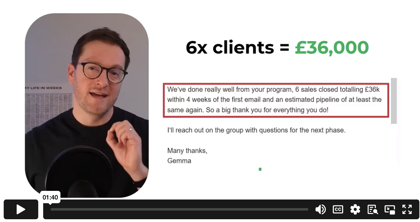
GIF thumbnails show how even a short looping image acts as a preview – hinting at what’s inside a video or message before anyone clicks play:
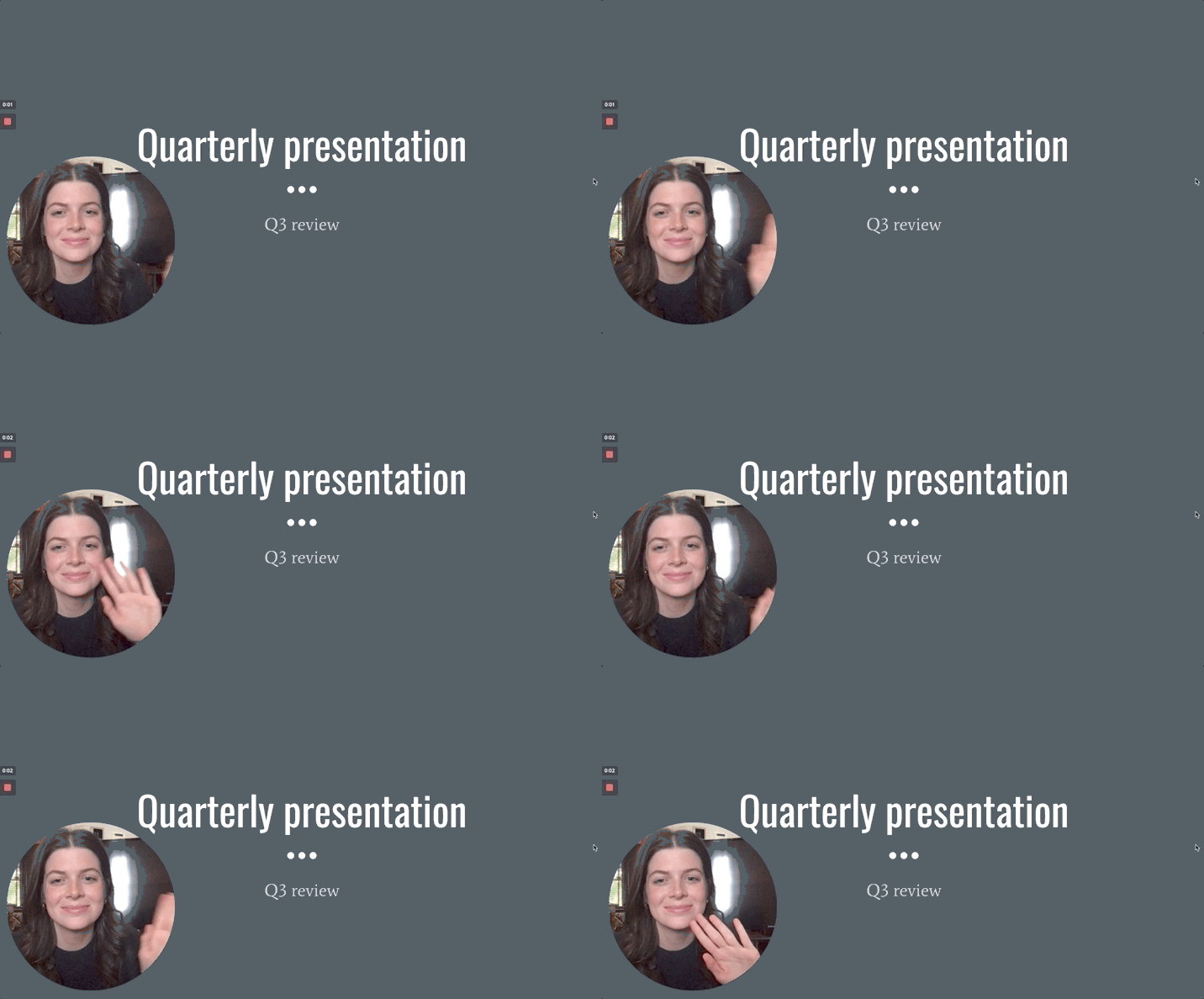
In each case, the preview does the same job. It signals whether the content is worth the next step. So the question to ask about every piece of content you create is simple: if someone only saw the preview, would they know why it matters to them?
See also