
Practical Sales Training™ > How to connect with your buyer > The One Pager Effect

The One Pager Effect
Most people will not read a long document. They skim the first page, lose interest, and move on. So all that time you spent writing pages two, three, and four was largely wasted.
The One Pager Effect builds on a simple truth. The shorter something is, the more likely it gets read. When you compress your message to a single page, you remove the barrier of effort. Buyers do not have to commit to reading. They just do.
But the benefit goes both ways. Cutting to one page does not just help the reader. It forces you to think clearly about what actually matters, so the best information leads and the rest falls away.
What Is the One Pager Effect?
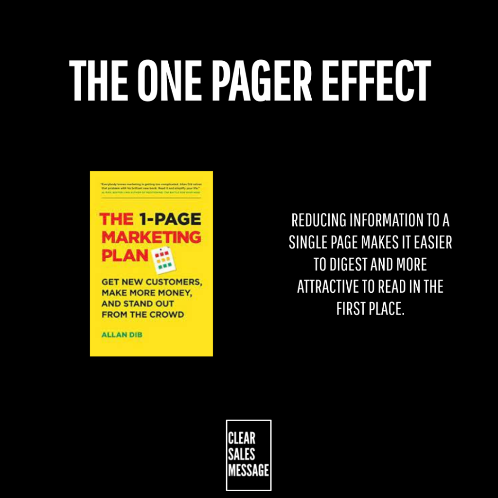
The One Pager Effect is the principle that condensing something to a single page dramatically increases the chance it gets read and acted on. Whether it is a product summary, a proposal, a how-to guide, or an internal briefing, a one-page version will always outperform a multi-page one for engagement.
The format also signals respect for the reader’s time. A one pager says: we know you are busy, so we did the hard work of editing this down for you. That impression matters, especially early in a sales relationship.
Why Does the One Pager Effect Work?
It works because effort is a barrier. The longer something looks, the more mental energy a reader needs to commit before they start. Most buyers will not make that commitment for something they did not ask for, so they skip it entirely.
A one pager removes that barrier. Because the whole thing fits on a single screen or sheet, the reader can see the end before they begin. That makes starting feel easy, and easy things get done.
There is also a focus benefit. Fitting your message onto one page forces you to lead with the most important things first and cut everything that does not earn its place. The content that remains ends up sharper, clearer, and more persuasive than anything buried in a longer document.
How Can You Use the One Pager Effect In Sales?
Create a One-Page Product or Service Summary
If a buyer asks what you do, a single well-designed page covering the key points beats a brochure or a long PDF every time. It gives them something they will actually read, something they can pass to a colleague, and something that positions your offer clearly without overwhelming them.
Use It for Proposals and Follow-Ups
A one-page proposal summary at the top of a longer document means the decision-maker gets the key points even if they never reach page two. Similarly, a one-page follow-up after a meeting keeps the conversation alive without asking the buyer to re-read a full pitch. Short follow-ups get read. Long ones get filed.
Apply It to Internal Comms Too
The One Pager Effect works just as well inside your business as it does externally. Briefings, updates, and process guides that fit on one page get absorbed. Those that run to multiple pages get skimmed or skipped. So use the one-page constraint as a discipline across all your written communication, not just your sales materials.
When the One Pager Effect Works Best
It works best when the reader is time-poor and the decision is time-sensitive. A buyer who needs to make a call quickly will gravitate toward the shortest useful summary they can find. If that summary is yours, you win the attention battle before a rival even gets opened.
The format also shines when content needs to travel. A one pager is easy to forward, print, share in a meeting, or pin to a wall. Because it asks so little of the next person who sees it, it spreads further than longer content ever could.
When the One Pager Effect Becomes Dangerous
The risk is in cutting so much that the page loses meaning. Brevity only helps when the essential information survives the edit. So if a buyer cannot understand your offer, your price, or your next step from a single page, you have cut too far. The goal is clarity, not minimalism for its own sake.
Also, some decisions genuinely need more detail. A one pager works well at the awareness or interest stage but may not serve a buyer who is deep in due diligence. In those cases, treat the one pager as the entry point to more detail, not a replacement for it.
Common One Pager Effect Mistakes
Shrinking the Font Instead of Editing the Content
Forcing ten pages of content onto one page by reducing the font size defeats the purpose entirely. A one pager should contain less content, not the same content made smaller. If someone needs a magnifying glass to read it, it is not a one pager. It is a ten-pager in disguise.
Leaving Out the Call to Action
A one pager without a clear next step wastes the opportunity. Because the reader finishes quickly, they need to know immediately what to do next. So always end with one clear action, whether that is a link, a number to call, or a simple instruction to reply.
Making It Look Like a Data Dump
A one pager crammed with bullet points, tables, and dense text puts readers off just as much as a long document. White space, clear headings, and a logical flow matter as much as length. Because the goal is ease of reading and not just brevity, design and layout deserve as much attention as the words.
The One Pager Effect – An Example
When Apple launches a new MacBook, they put a single-page tech spec summary on their website. Rather than asking buyers to read through a manual, the page condenses everything that matters: performance figures, display details, battery life, storage options, and connectivity, all in one clean, scannable layout.
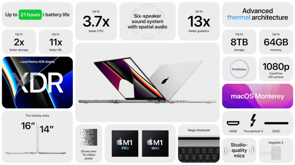
The spec sheet above covers a huge range of features without overwhelming the reader. Because everything sits together on one page, buyers can scan for what matters to them and reach a decision fast. That is the One Pager Effect in action: less effort for the reader means more decisions in your favour.
See Also: