Practical Sales Training™ > How To Get Attention > Visual Merchandising

Visual Merchandising
What Is It
Visual merchandising is the deliberate arrangement of products and displays so the eye moves where you want it to. It’s not decoration. It’s a quiet form of persuasion built entirely out of placement, spacing, and height.
Walk into any well run shop and notice how little is left to chance. The item you’re meant to see first sits at eye level. The one they want you to buy on impulse sits by the till. None of that happens by accident.
Why Does It Work
The eye follows patterns before the mind makes a decision. Colour, spacing, and height all pull attention automatically, long before someone consciously chooses what to look at.
Arrangement also signals value. A single product on a clean, well lit shelf looks more premium than the same product crammed among a dozen others. The buyer reads the display as much as they read the product itself.
How Can You Use It
Put Your Best Seller At Eye Level
Eye level gets the first look, every time. Whether it’s a shelf, a homepage, or a menu, put what you most want people to choose exactly where their gaze naturally lands first.
Use Space As A Signal Of Value
A cramped display suggests bargain. Empty space around a product suggests premium. Decide which impression you want before you decide how much you’re cramming onto the shelf or the page.
Guide The Path, Not Just The Product
Think about the order things get seen in, not just what’s on display. A good layout leads the eye from one point to the next, building toward the thing you actually want someone to buy.
When It Works Best
This works best anywhere a buyer is browsing rather than searching for something specific. Retail shelves, homepages, menus, and storefront windows all rely on it to shape a decision the buyer thinks they made on their own.
When It Becomes Dangerous
Overcrowded displays overwhelm rather than guide. If everything competes for attention, nothing wins it, and the buyer’s eye just slides past the whole thing.
It also backfires if the arrangement misleads what’s actually available. Featuring something out of stock, or making a display look bigger than the real selection, damages trust the moment the buyer notices the gap.
Common Mistakes
Treating Every Product As Equally Important
If everything gets the same space and prominence, nothing stands out. Decide what actually deserves the best position, and let everything else sit around it.
Ignoring How People Actually Look
Most people scan in predictable patterns, whether that’s a shelf or a screen. Arranging a display without thinking about that path wastes the best positions on things nobody sees first.
Overfilling The Space
More products crammed into a display doesn’t mean more sales. It usually means less attention per item. A cleaner, more selective layout often sells more than a full one.
Visual Merchandising – An Example
Apple’s Single Product Tables
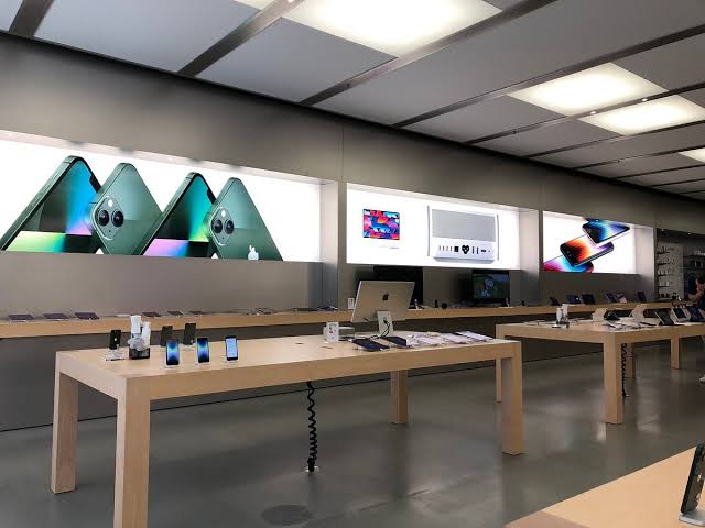
Walk into an Apple Store and notice how few products are actually on show at once. Each table holds one device, spaced generously, lit carefully, with nothing competing for attention around it.
That restraint is the whole strategy. Less on display makes each product look more valuable, not less available. Buyers walk in expecting a wall of options and instead get a single item treated like it matters. The display does half the selling before a staff member says a word.
See Also