Practical Sales Training™ > How To Get Attention > Colour Psychology
What is it?
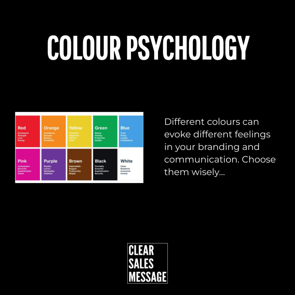
When you see certain colours, you think and feel certain things. Using the right colours in your branding is an essential component to successful communication.
Why does it work?
It works because it’s part of human nature. We take in cues from our environment and use shortcuts in thinking such as schemas and heuristics to understand the world around us and make connections between people, places and things.
If you consider well known brands such as IBM or Coca Cola and how their branding makes you feel, you can see first hand just how important and powerful this is.
How can you use it?
According to Wikipedia, these are the different meanings for the different colours. It’s no surprise that Blue is associated with corporate and competenece, Green relates to the environment and Orange communicates excitement.
The question is, which colours are you using and do they convey what you need them to, or is it time to consider changing them?
Hypothetical Example:
A financial consultancy originally uses bright orange and pink tones in its branding. While the colours are eye-catching, they don’t communicate the trust, stability, and professionalism that clients expect when choosing a financial partner.
After learning about colour psychology, the consultancy rebrands with deep blues and greys, colours associated with competence, reliability, and confidence.
As a result, their website and marketing materials immediately feel more aligned with client expectations, leading to increased trust and better conversion rates.
See also


