Practical Sales Training™ > How To Convert > Order Success Page

Order Success Page
What Is It
You just took someone’s money. So the very next screen they see matters more than almost any other page on your site.
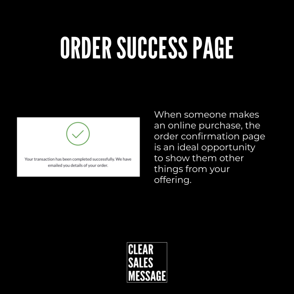
That screen is the order success page. It confirms the order went through, shows what they bought, and tells them what happens next. Some people call it a thank-you page. Others call it a confirmation page. Either way, it’s the first thing a buyer sees after they’ve committed.
Why Does It Work
It works because it kills uncertainty the moment it appears. Right after paying, a buyer often feels a flicker of doubt. They wonder if the payment worked, or if they made the right call.
A clear success page answers both questions instantly. So it reassures them, confirms the decision, and points them toward what happens next. Trust is highest right after a purchase. So this is also the best moment to add a next step, a referral link, or a related offer.
How Can You Use It
Confirm The Order Clearly
Confirm the order clearly first. Show the order number, what they bought, and when it’s arriving. This single moment either builds confidence or plants doubt, so get the basics right before anything else.
Guide Them To What’s Next
Once you’ve confirmed the order, guide them toward what happens next. Link to their account, explain shipping timelines, or show how to track the order. A buyer who knows what’s coming worries less and complains less.
Use The Trust While It’s High
Use the moment while trust is high. Add a referral link, a social follow, or a related offer. Buyers are more open right after a purchase than at almost any other point. So don’t waste it on a blank confirmation screen.
When It Works Best
This page earns its keep on every single order, since every buyer passes through it. So it works best when it feels personal instead of generic. It also works best when the next step is obvious, not buried.
When It Becomes Dangerous
It becomes dangerous when it’s an afterthought. A blank, generic confirmation screen wastes the most trusting moment in the entire buying journey. So does a page stuffed with upsells before the order’s even been properly confirmed.
Common Mistakes
Treating It As A Formality
Treating the page as a formality instead of an opportunity. A bare confirmation with no next step leaves the buyer to figure things out alone. That quietly increases support tickets and refund requests.
Pitching Before Confirming
Pushing an upsell before confirming the order properly. Buyers also want reassurance first. So lead with confirmation, then offer more, never the other way round.
Ignoring What Comes After The Click
Ignoring what happens after the click. Shipping times, login details, and support links all belong here. A confused buyer is far more likely to ask for a refund than a confident one.
Order Success Page – An Example
Walmart’s Cash-Back Follow-Up
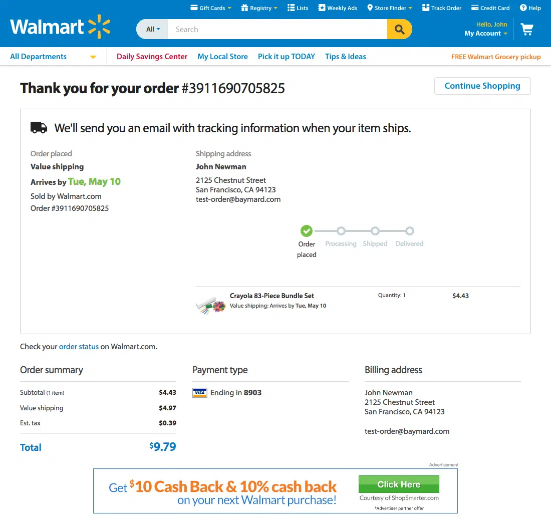
Walmart uses this moment well. Their order success page confirms the purchase clearly. Then it hands the buyer a cash-back offer while trust is still at its highest.
That single addition turns a routine confirmation into another sale, or at least another reason to come back. It costs Walmart nothing extra to show, yet it moves buyers who were already primed to say yes.
See Also
- The Next Steps Effect
- The With Purchase Effect
- 180+ ways to improve conversion
- 40+ ways to increase buyer spend