Practical Sales Training™ > How To Get Attention > Kinetic Typography
Kinetic Typography
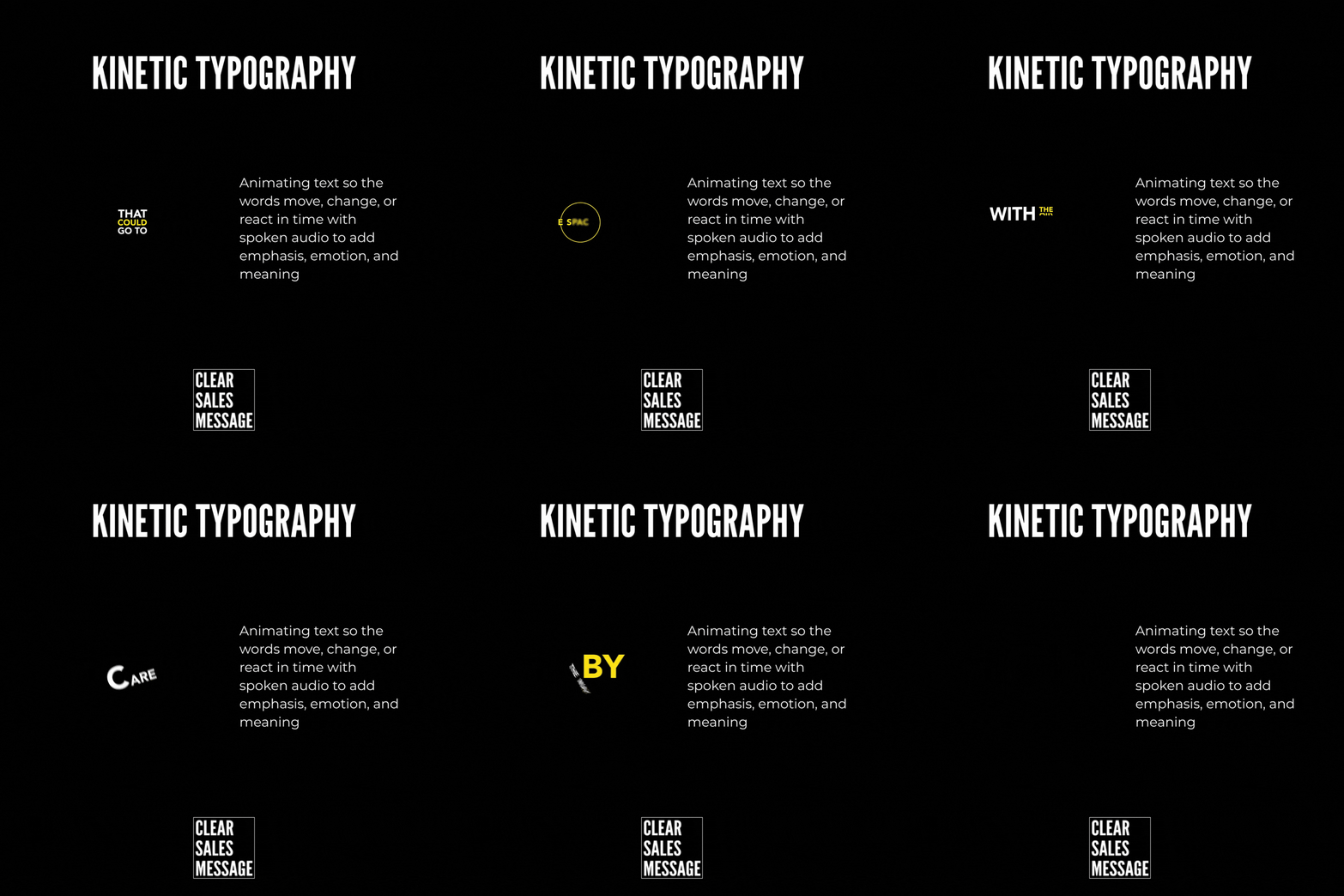
Still text sits there. Moving text grabs you. That single difference is the whole idea behind kinetic typography.
Instead of words sitting flat on a screen, they animate, shift, react, or appear in time with spoken audio. So you’re not just reading the words anymore. You’re feeling them.
This page covers what kinetic typography is, why it holds attention so well, and how to use it without needing a animation degree.
What Is Kinetic Typography?
Kinetic typography is text that moves. Instead of sitting still on a screen, the words animate, change, react, or appear in rhythm with whatever’s being said.
That movement adds emphasis, emotion, and meaning that plain text simply can’t carry on its own. So the words stop being something you skim past, and start being something you actually watch.
Why Does Kinetic Typography Work?
It works by lining up motion with meaning, rather than treating text as a static afterthought.
First, the words follow the voice. As something gets said, the words appear, shift, grow, or break apart right in time with the audio. So the timing itself becomes part of the message.
Movement also points to what matters most. A key word might pause, jump, shake, or change colour, so the eye instantly knows where to look.
And because of that motion, the brain stays engaged for longer. Movement resets attention. Instead of skimming ahead, the viewer keeps watching just to see what happens next. So the text becomes part of the performance, not just a caption sitting underneath it.
How Can You Use Kinetic Typography In Sales?
Start Simple
You don’t need complex animation to make this work. Try letting one word arrive a beat later for impact, enlarging or isolating a key phrase, breaking a sentence apart line by line, or letting the words react to tone, pace, or silence.
Use It Where It Matters Most
It’s especially powerful for social videos, short-form content, hooks and opening lines, and explaining abstract ideas quickly. So save it for the moments where attention is hardest to earn.
When Kinetic Typography Works Best
It works best in the first few seconds of a video, exactly where most viewers decide whether to keep watching or scroll past. Movement at that moment buys you a little extra time.
It also shines when you’re trying to explain something abstract quickly, since motion can carry a feeling that plain narration alone would take a full sentence to describe.
When Kinetic Typography Becomes Dangerous
It backfires when there’s too much movement happening at once. If every word is jumping, shaking, or changing colour, nothing actually stands out, because the eye has nowhere calm to land.
It can also distract from the message itself. If the animation feels flashier than the point being made, viewers remember the effect and forget what you were actually trying to say.
Common Kinetic Typography Mistakes
Animating Every Single Word
Constant movement loses its power fast. Save the motion for the words that actually deserve the emphasis.
Ignoring The Audio Timing
Text that moves out of sync with the voice feels off, even if the viewer can’t quite say why. Keep the rhythm tightly matched to what’s being said.
Choosing Style Over Clarity
A clever animation that’s hard to read defeats the whole point. The words still need to be legible first, impressive second.
Kinetic Typography – An Example
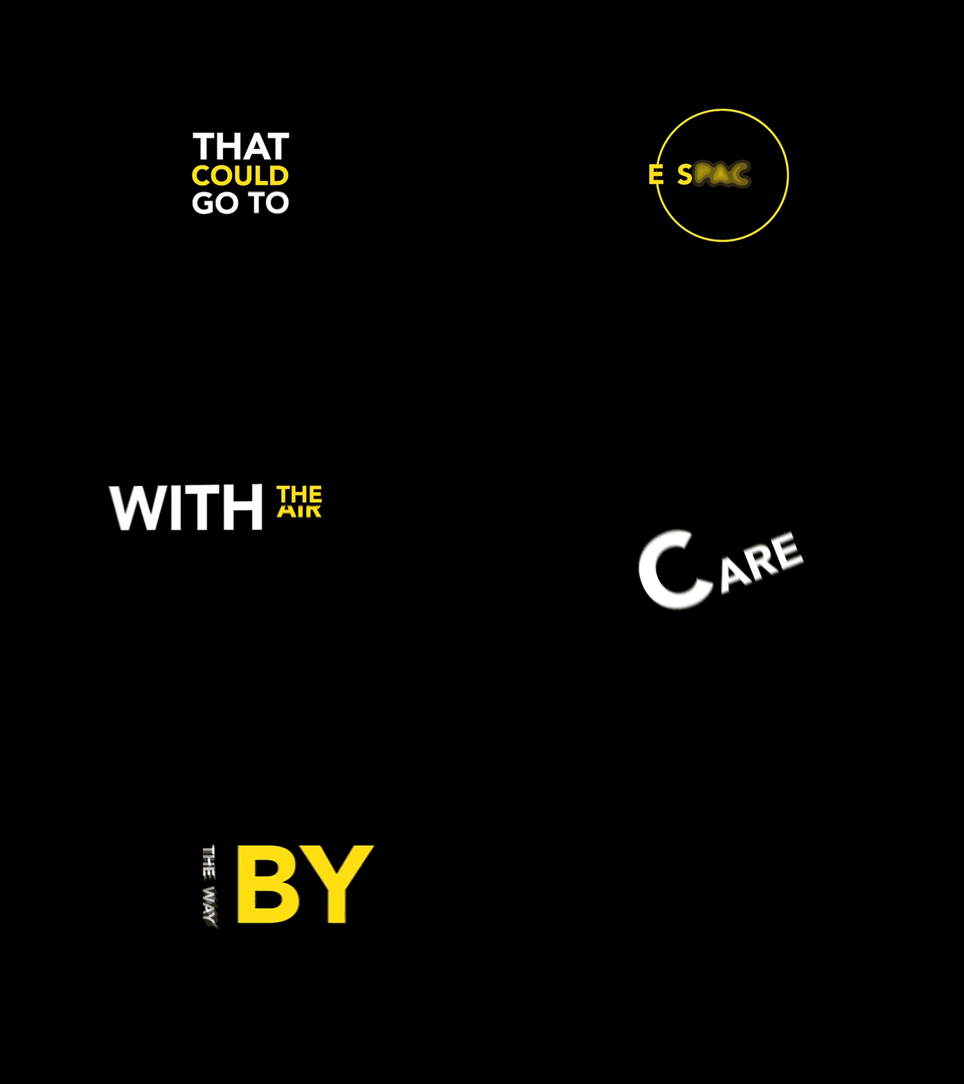
A short clip on a plain black background builds a sentence one word at a time. Each word fades in on its own beat, rather than the whole line appearing at once.
One word breaks the pattern with a colour change, while the rest stay in plain white. That single shift is enough to pull the eye straight to it, without needing any extra graphics or movement elsewhere on screen.
That’s kinetic typography doing its job. The viewer isn’t reading a static line of text. They’re watching a sentence build in front of them, word by word, which is exactly the kind of motion that holds attention long enough to land.
See also