Practical Sales Training™ > How People Work > Choice Architecture
Choice Architecture
Think about the last time you picked a plan on a pricing page. You probably felt like you made a free choice. But someone decided which plan sat in the middle, which one got the badge and which one you saw first. And that nudged you.
That’s choice architecture. You can’t avoid it, because every set of options has a layout. So the real question is whether you design it on purpose or leave it to chance.
What Is Choice Architecture?
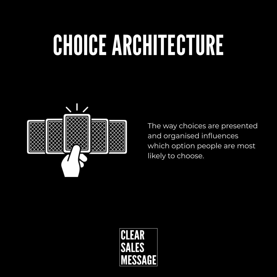
Choice architecture means the way you present and organise choices. That layout influences which option people are most likely to choose.
It covers lots of small decisions. The order of your options, which one you highlight and which one comes pre-selected all count. So does your wording.
The idea became well known through the book Nudge by Richard Thaler and Cass Sunstein. Their point was simple. There’s no neutral way to present a choice. Something always comes first.
Why Does Choice Architecture Work?
People don’t weigh up every option carefully. They’re busy, so they take shortcuts. In fact, they often pick the option that looks recommended, comes first or needs the least effort.
Defaults are especially powerful. Whatever comes pre-selected feels like the normal choice. As a result, lots of people simply leave it as it is.
Layout also tells buyers what you think. A highlighted plan says “most people like you pick this.” So the buyer feels safer following that lead than working it all out alone.
How Can You Use Choice Architecture?
Highlight the Option You Want Chosen
Pick the option that suits most buyers and make it stand out. Give it a badge, a colour or a label like “Most popular.” Then buyers who feel unsure have a safe place to land.
Set a Smart Default
Decide what comes pre-selected. For example, you might default to the annual plan or the free trial. Most buyers stick with what’s already chosen. So make sure that default really suits them.
Cut the Number of Options
Too many choices slow people down. And slow buyers often don’t buy at all. So keep it to three or four clear options where you can.
Help Unsure Buyers Choose
Some people still won’t know which option fits. So give them a quick quiz or a “Not sure? Start here” route. That way, nobody leaves just because the choice felt hard.
When Does Choice Architecture Work Best?
Choice architecture works best on pricing pages, sign up forms and checkouts. Anywhere a buyer has to pick between options, layout makes a difference.
It also works well when buyers don’t know much about what you sell. The less they know, the more they rely on your cues.
Finally, it suits busy buyers. When people want to decide fast, a clear lead option saves them time. And they thank you for it with a sale.
When Does Choice Architecture Become Dangerous?
Choice architecture gets dangerous when it tricks people. Hidden costs, pre-ticked add-ons and confusing cancel buttons might win a sale today. But they cost you trust, and they can break consumer rules too.
It also backfires when you push the wrong option. If your highlighted plan doesn’t suit the buyer, they’ll feel misled once they use it. As a result, refunds rise.
And watch out for hiding the cheaper options. Buyers notice. So keep every option easy to find, even if one gets the spotlight.
What Are the Common Mistakes With Choice Architecture?
Treating Every Option the Same
When all your options look equal, buyers have to work harder. So guide them. Make one option the clear starting point.
Leaving Defaults to Chance
Every form and pricing page has a default, even if you never chose one. So check what comes pre-selected. Then make it deliberate.
Offering Too Much Choice
More options can feel generous. However, they often lead to doubt and delay. So cut back to the few that matter.
Nudging Without Explaining
A highlight works better with a reason. So say why that option is the one most people pick. Then the nudge feels like advice.
Choice Architecture – An Example
Mailchimp’s Pricing Page
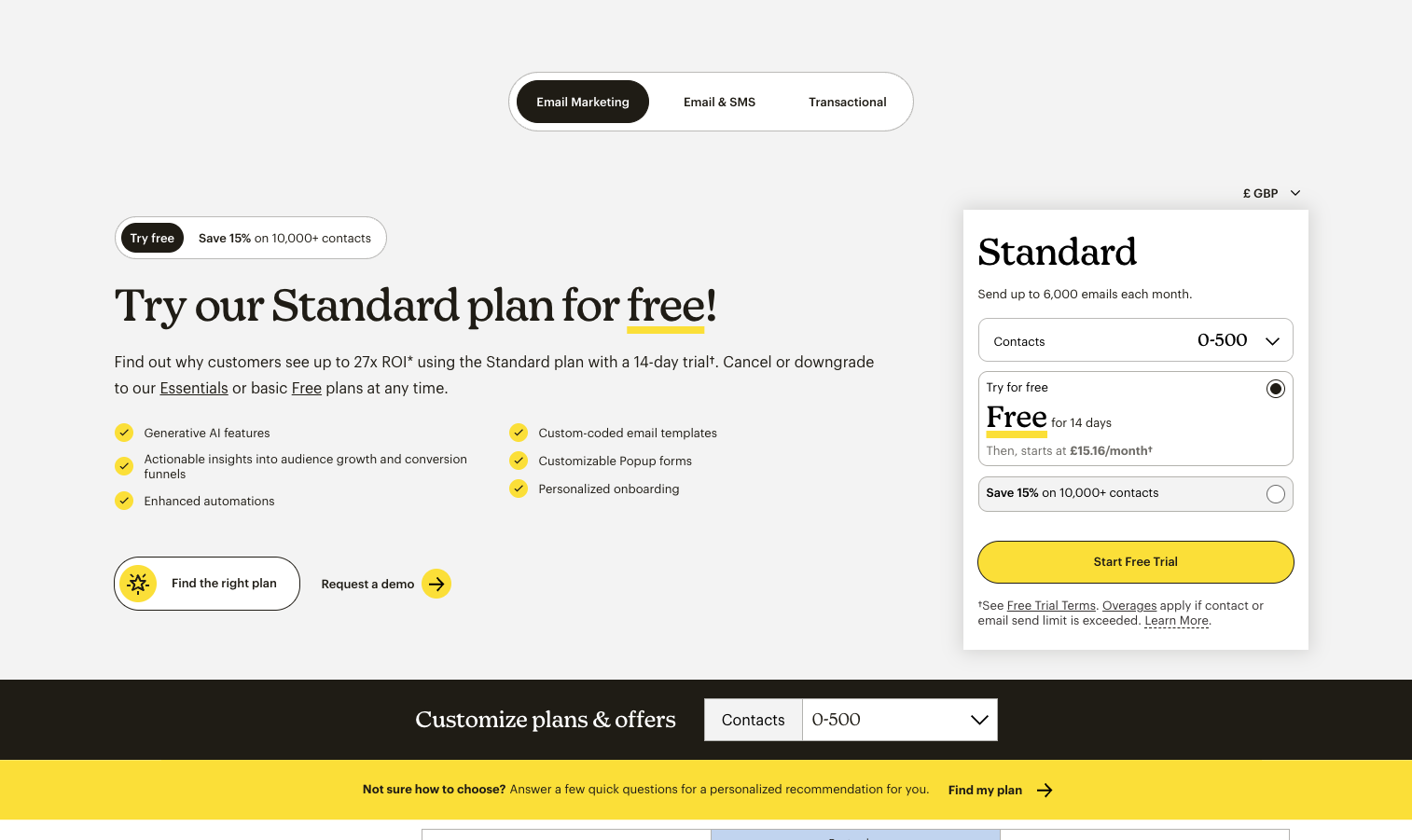
It presents its plans side by side. It prominently promotes “Try our Standard plan for free!” while keeping the other options available. Mailchimp
That’s choice architecture: the layout and emphasis guide your attention towards a particular option.
Look at how many small choices work together here. The free trial comes pre-selected. Standard also gets the big headline. Meanwhile, the cheaper plans stay on offer. They just don’t shout. And for people who still can’t decide, there’s a quick way to find the right plan. So visitors drift towards the trial.
See Also