Practical Sales Training™ > Selling Communication Basics > De Facto Standards

De Facto Standards
Green means go. Red means stop. Nobody taught you that this week. You learned it years ago, and it’s stuck ever since.
That’s a de facto standard. And your buyer is using dozens of them to read your page right now, often without realising it.
What Is A De Facto Standard?
A de facto standard is a signal your audience already recognises. It could be a colour, a shape, a symbol, a phrase, or even a layout. None of it needs explaining, because people already know what it means.
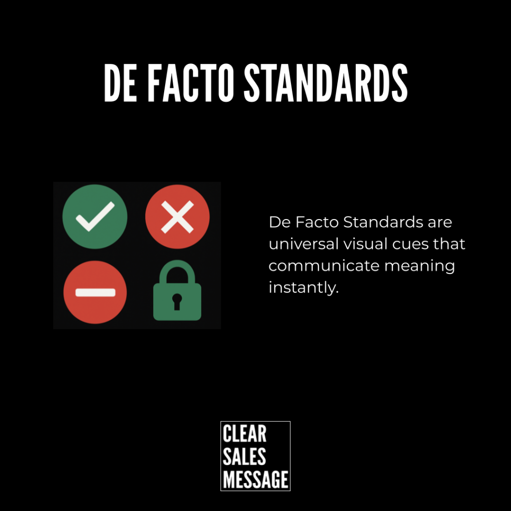
Green means go or success. Red means stop, danger or error. A tick means correct. A cross means wrong. A padlock means safety. Stars mean quality. You didn’t have to learn any of that just now, because you already knew it.
These signals speak straight to instinct. They get processed faster than words do, which makes them one of the most useful tools you have in sales communication.
Why Does It Work?
People don’t read everything on a page. They scan for signals they already understand, and they skip the rest. So when you use a familiar cue, your message gets easier to understand, faster to trust, and simpler to act on.
This works because de facto standards don’t need to be learned in the moment. Your audience already knows what they mean, since they’ve seen them a thousand times before. Use them deliberately, and you remove friction. Buyers act with more confidence, and they do it faster.
How Can You Use De Facto Standards?
Use Colour On Purpose
Red works for warnings or urgency. Green works for confirmation or safety. Amber or orange signals caution. Blue feels calm and trustworthy. None of this is random, so don’t pick colours just because they look nice on the page.
Stick To Familiar Layouts
Keep your navigation, headings, calls to action and testimonials where people expect them. If your layout feels unfamiliar, people hesitate, because they have to work out where things are before they can even read your message.
Add Visual Symbols Where They Fit
Ticks, crosses, padlocks, clocks and stars all reinforce your message instantly. They do the explaining for you, so you don’t have to spell everything out in words.
Write Like A Buyer, Not A Copywriter
Use the phrases people already expect to see. “Buy now.” “Get started.” “Secure checkout.” These aren’t exciting, but that’s exactly the point, because familiar language feels safe and doesn’t slow anyone down.
Borrow Trust From What People Already Know
If your product looks visually aligned with brands your audience already respects, you instantly feel more credible. Familiarity builds confidence before you’ve said a single word about your product.
When It Works Best
De facto standards work best when your buyer is moving fast and doesn’t want to stop and think. A rushed customer on a checkout page relies entirely on signals like a padlock icon or the word “secure,” since they don’t have time to read your full privacy policy.
They also work well anywhere trust needs to be built quickly, like a first-time visit to your site. Familiar cues do in half a second what an entire paragraph of copy would otherwise need to explain.
When It Becomes Dangerous
De facto standards backfire the moment you use them incorrectly. If you use red for a positive message, people feel a flicker of alarm before they even read the words. That confusion costs you trust, even if the mistake seems small to you.
It’s also risky to lean on a standard your specific audience doesn’t share. Colour meanings can shift across cultures and industries, so a signal that works for one audience might confuse another completely.
Common Mistakes
Choosing Colour For Looks, Not Meaning
Picking a colour scheme because it matches your brand, while ignoring what that colour actually signals, creates confusion. A soft red “confirm” button might look elegant, but it quietly triggers hesitation in your buyer’s mind.
Reinventing Layouts For The Sake Of Being Different
Some businesses move their navigation or checkout button just to feel unique. But unfamiliar layouts slow people down, and a hesitant buyer is far more likely to leave without buying.
Overusing Symbols Until They Lose Meaning
A page covered in ticks, stars and padlocks stops feeling trustworthy and starts feeling like a sales trick. Use these symbols where they genuinely apply, not as decoration.
De Facto Standards – An Example
When A Product Breaks The Standard
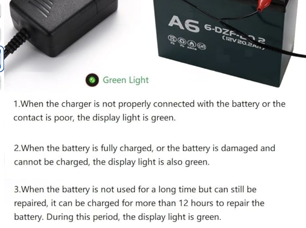
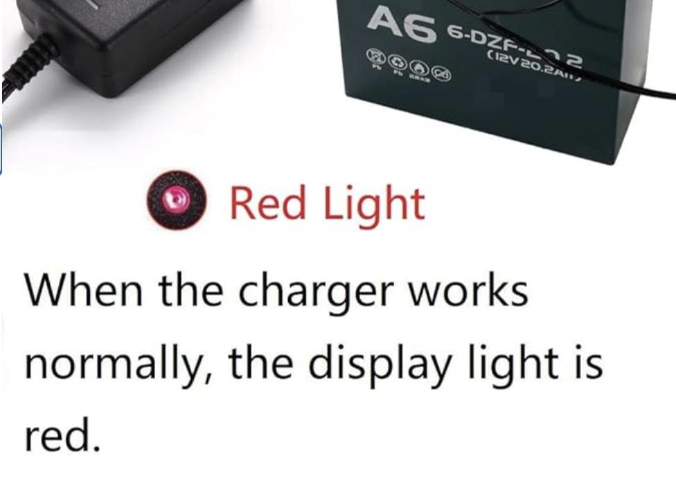
This battery charger runs backwards from what every buyer expects. Green usually means “all good.” Here, it means the opposite. Red is the colour that tells you charging is going well.
That reversal creates instant confusion, even for someone who reads the manual carefully. A buyer glances at the light, assumes green means success, and walks away thinking their battery is fine when it isn’t. So the manufacturer has to spell it out in a paragraph of text just to undo what the colour was already telling people. That’s the real cost of ignoring a de facto standard. You end up explaining something a single colour should have handled on its own.
See Also
- The Icon Effect
- The Traffic Light Effect
- 25+ Selling communication basics
- 100+ ways to get your buyer to take action