Practical Sales Training™ > How To Get Attention > The Icon Effect

The Icon Effect
What Is It?
Words matter. But a graphic can grab attention faster than any sentence.
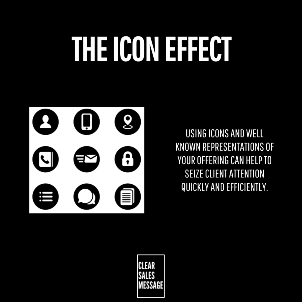
The Icon Effect uses symbols people already know. Think padlocks, chat bubbles, phones and checkmarks. You’ve seen them a thousand times before, so your brain reads them instantly.
Why Does It Work?
We already understand certain signs from everyday life. A padlock means secure. A speech bubble means chat. You don’t need to explain that, since the meaning is already built in.
So when you use these icons in your messaging, you shortcut understanding. The buyer gets the point before they’ve read a single word of copy.
That speed matters. Attention is short, and icons work faster than sentences ever can.
How Can You Use It?
Pick Icons People Already Know
Stick to symbols that are already common. A padlock, a phone, a checkmark. These carry meaning instantly, so don’t invent your own icon language when a familiar one already does the job.
Pair Icons With Short Text
An icon alone can be vague. So pair it with a short label underneath or beside it. The icon grabs attention first, and the text confirms exactly what it means.
Use Them Where Attention Is Scarce
Landing pages, feature lists and quick scans are ideal spots. These are places where buyers skim rather than read, so icons do the heavy lifting before the words get a chance.
When It Works Best
This works best on pages designed for skimming, like landing pages and feature sections. Buyers there are scanning fast, so a strong visual cue earns attention that plain text would miss.
It also works well for digital products and apps, where icons are already part of the buyer’s daily experience. In that setting, familiar symbols feel natural instead of decorative.
When It Becomes Dangerous
The risk is using icons that aren’t actually familiar. An unusual or clever icon can confuse instead of clarify, and confusion is the opposite of what you want here.
Too many icons on one page also causes clutter. If everything is trying to grab attention, nothing actually does.
Icons should support your message, not replace it. Used alone, without any text, they can leave buyers guessing at the exact meaning.
Common Mistakes
Choosing Unfamiliar Symbols
A clever icon means nothing if buyers don’t recognise it instantly. So stick with symbols that are already part of everyday life.
Overloading The Page
Too many icons compete for attention at once. So use them sparingly, and let each one earn its place.
Dropping The Supporting Text
An icon without a label can still be ambiguous. So keep a short line of text nearby, even if the icon does most of the work.
The Icon Effect – An Example
The Password Manager Landing Page
A password manager app uses this visual structure on its landing page:
🔒 Secure – Military-grade encryption protects your data
💬 Support – Live chat available 24/7
📱 Access Anywhere – Use on phone, tablet, or desktop
✅ Simple Setup – Get started in under 2 minutes
Each icon grabs attention before the text is even read. A padlock already means security to most people. A speech bubble already means chat. So the brain processes the message instantly, before it even reaches the words.
This reduces friction on the page. Buyers understand the offer fast, and fast understanding is exactly what turns a scroll into a sign up.
See also