Practical Sales Training™ > How To Get Attention > Favicon

Favicon
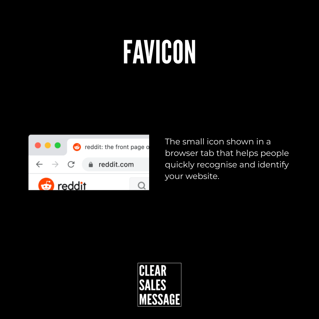
A favicon is the small icon that sits in a browser tab. It sits right next to your page title, tiny and easy to miss. Yet it’s one of the first things a visitor sees.
Most people never notice it consciously. But their eyes still register it, tab after tab, site after site. It works quietly in the background of every visit.
Why Does It Work
Most people keep several tabs open at once. So a favicon lets someone spot your site among a crowd of others without reading a single word. Shape and colour do all the work.
Recognition builds trust too. A familiar icon signals a real, established business. In contrast, a blank or generic tab looks unfinished or untrustworthy.
It also helps people return. Someone who bookmarks your site relies on that tiny icon to find you again. It stands out fast, even among dozens of open tabs.
How Can You Use It
Keep it simple and recognisable
Use one bold shape or letter, not a detailed logo. At such a small size, detail disappears completely.
Match your brand colours
Use the same colours as your logo or site. This builds instant recognition, since visitors already associate those colours with you.
Test it at actual size
View your favicon at real browser-tab size before publishing it. What looks clear on a large screen can blur into nothing at sixteen pixels.
When It Works Best
This matters most for buyers who research across many sites at once. Comparison shopping and multi-tab research both depend on it. So do repeat visits, since the icon guides someone back.
It also helps most for businesses buyers bookmark or revisit often. A recognisable icon in a bookmarks bar works the same way it does in a tab.
When It Becomes Dangerous
A missing favicon looks unfinished. Browsers show a generic blank page icon instead. That can make a real business look unofficial or abandoned.
A favicon that’s too detailed becomes a problem too. At such a small size, a busy design turns to mush. Nobody can read it.
Common Mistakes
Using a shrunk full logo
A full logo crammed into a tiny square usually turns to mush. Simplify it down to one shape or letter instead.
Forgetting mobile browsers
Some devices display the favicon differently. Check how it looks across both desktop and mobile before publishing.
Never updating it after a rebrand
An old favicon left in place after a logo change confuses returning visitors. Update it the same day you update everything else.
Favicon – An Example
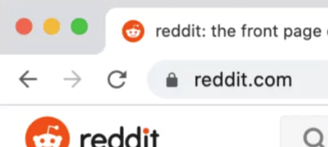
A recognisable icon in the tab bar
A clear favicon does its job the moment someone glances across their open tabs. It works even when the tab itself is too narrow to show any text.
See Also
- 100+ ways to seize buyer attention
- Animated Profile Picture
- The Signature Effect
- The Signature Emoji