Practical Sales Training™ > How To Get Attention > Kid Designed Logo

Kid Designed Logo
What Is It
A Kid Designed Logo means exactly what it sounds like. You hand a child some pens, give them a simple brief, and let their drawing become part of your brand. No agency polish. No perfect angles. Just a child’s honest attempt at drawing what your business means to them.
It sounds like a small gimmick at first. But it taps into something buyers respond to fast, because a child’s drawing can’t lie. There’s no hidden agenda in a wobbly crown or a lopsided star. That rawness is the whole point.
Why Does It Work
Most branding tries hard to look perfect, and buyers have learned to distrust perfect. Sharp edges and flawless design read as corporate, and corporate reads as distant. A kid’s drawing breaks that pattern instantly, since nobody expects a business to hand its identity to a child.
That unexpectedness earns attention on its own. But the deeper reason it works is trust. A child has no reason to flatter your brand or dress it up. So when their drawing represents you, it feels like proof rather than marketing. You’re borrowing their honesty, and buyers can sense the difference.
How Can You Use It
Use It For A Single Campaign, Not Your Core Identity
Don’t replace your main logo with a child’s drawing forever. Use it for a limited moment instead, like a local event, an anniversary or a community push. This keeps the charm intact because it stays a special appearance rather than becoming background noise.
Tie It To A Real Occasion
A kid’s drawing lands best when there’s a genuine reason behind it. A school competition, a local celebration, a milestone worth marking. Without that context, it can look like a stunt. With it, the drawing becomes part of a story your buyers actually want to follow.
Show The Process, Not Just The Result
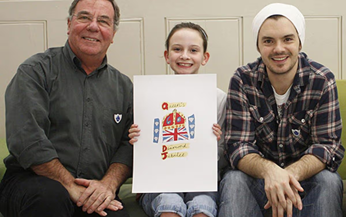
The finished drawing is only half the value. Show the child holding it. Show the moment they picked their colours. That behind the scenes glimpse builds far more warmth than the logo alone ever could, since people connect with the story behind the image just as much as the image itself.
Let It Stay Imperfect
Resist the urge to clean it up. A designer smoothing out the lines defeats the entire purpose. The wobble is the message. It tells your buyer this is real, made by a real child, not touched up by a real agency.
When It Works Best
This works best for brands with a local, community or family feel. A neighbourhood shop, a school fundraiser, a local charity event. It also works well around national or shared moments, celebrations everyone already feels warm about, where a child’s take on the occasion adds charm rather than confusion.
When It Becomes Dangerous
It becomes risky fast in serious or high stakes sectors. A law firm or a medical practice can’t afford to look unserious, so a child’s drawing there undermines trust instead of building it. Match the tactic to a brand where warmth helps rather than one where credibility is everything.
It also backfires if it feels exploitative. If buyers sense the child was used purely for marketing gain with nothing genuine behind it, the goodwill flips into cynicism. Keep the motive honest and the occasion real.
Common Mistakes
Editing The Drawing Too Much
Straightening lines or fixing colours removes exactly what made it work. Once it looks designed, it loses the honesty that earned attention in the first place.
Using It Without Context
A random kid’s drawing with no explanation just looks odd. Buyers need to know why it exists. Give them the occasion, and the drawing suddenly makes sense.
Choosing The Wrong Brand For It
Not every business earns warmth from playfulness. A brand built on precision or authority can lose credibility fast if it suddenly looks childlike without a clear reason.
Kid Designed Logo – An Example
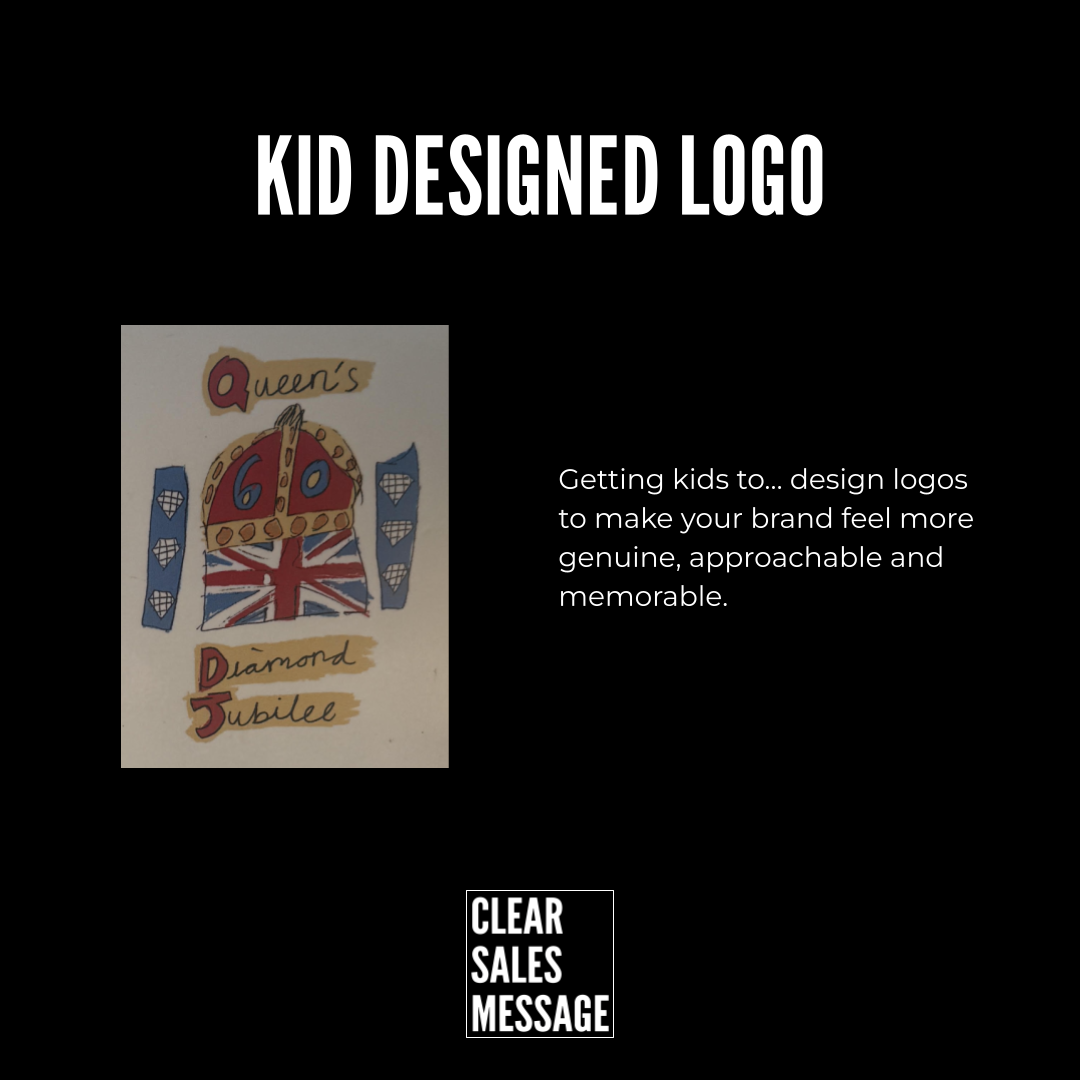
The Queen’s Diamond Jubilee logo in 2012 came from exactly this idea. Instead of hiring a design agency, the competition was opened to children across the country, and a ten year old’s drawing was chosen as the winning emblem.
It featured a crown, a Union Jack and the number sixty, all drawn with a child’s rough, honest hand. It wasn’t polished, and that’s exactly why it worked. It felt like it belonged to the public rather than to a boardroom, which is the whole reason this approach earns attention that a slick design agency often can’t.
See Also