Practical Sales Training™ > Wordplay > Ligature

What is it?
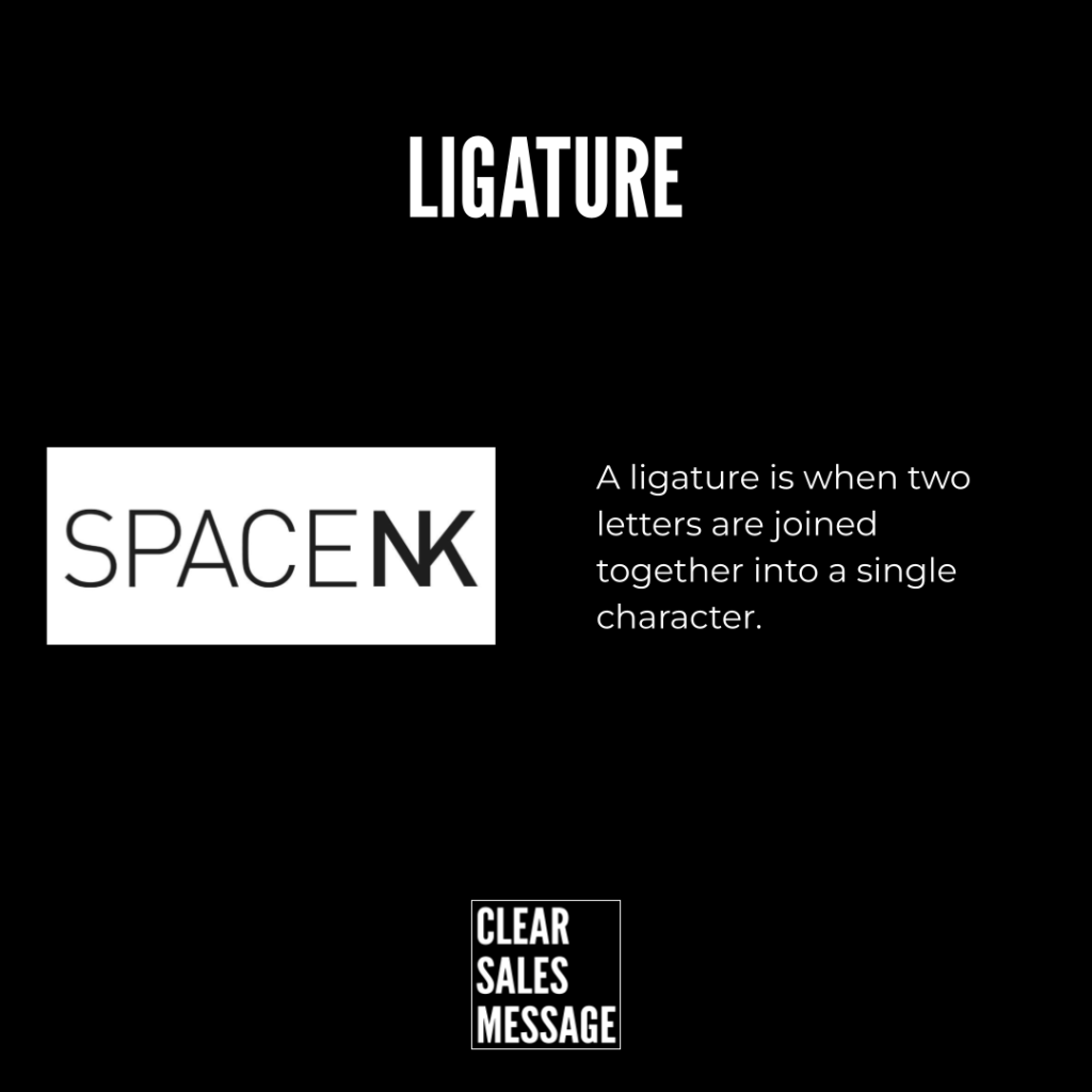
Ligatures are special characters in typography where two or more letters are joined together to form a single symbol. They were originally created to improve the flow of handwriting and later adapted into printing and digital fonts to make text easier to read and more visually appealing.
Common examples of ligatures include:
-
fi
-
fl
-
ff
-
æ (a and e joined together)
You will often see ligatures in professional typography, logo design, and high-quality printed materials.
How does it work?
Ligatures work by smoothing awkward gaps or overlaps that appear when certain letters sit next to each other. For example, in some fonts the dot of the “i” in “fi” can clash with the top of the “f.” A ligature merges them into a single character that looks cleaner and more balanced.
They are effective because:
-
They improve readability by creating smoother word shapes
-
They enhance design by giving text a more polished look
-
They add personality when used creatively in logos or branding
-
They signal quality because ligatures are often associated with premium typography
How can you use it?
You can use ligatures to improve both the aesthetics and clarity of your text.
-
Branding and logos: Use custom ligatures to create unique and memorable wordmarks
-
Printed materials: Choose fonts with ligatures to make brochures, books, and magazines more professional
-
Web design: Enable ligatures in CSS to improve on-screen readability and style
-
Creative design: Experiment with stylised ligatures to add personality and distinctiveness to your message
Tips for success:
-
Use ligatures consistently so your text feels intentional, not random
-
Avoid overusing decorative ligatures, as they can reduce readability if applied to every word
-
Test how ligatures display across different devices and print formats
The principle is simple. Ligatures make text cleaner, smoother, and more distinctive. They show attention to detail that can elevate your message.