Practical Sales Training™ > How To Connect With Your Buyer > Skeuomorphic

Skeuomorphic
Skeuomorphic means designing something new to look like something old. A digital object borrows the shape, texture, or details of a physical one. So people then know how to use it without being told.
Early smartphone apps did this constantly. A notes app looked like a yellow legal pad, and a calculator app looked like a real calculator with buttons. None of these choices were accidents.
Why Does It Work
Buyers already carry a mental model of how physical objects work. A bookshelf holds books, and a calculator has buttons. So when a new product mimics that shape, the brain skips the learning step. It feels instantly familiar.
This matters most when you’re introducing something genuinely new. A brand new idea has no shortcut through familiarity. So it has to borrow one. Skeuomorphic design lends that shortcut, even if just for a moment.
The trick fades once the audience learns the new pattern on its own. Once someone understands touchscreens, a fake wood shelf stops adding value. This is why skeuomorphic design tends to disappear as a product matures.
How Can You Use It
Borrow a shape people already trust
When you launch something new, dress it in a shape from something familiar. Maybe a subscription box that opens like a treasure chest. Or a software dashboard laid out like a physical control panel. The shape does half the explaining for you.
Match the metaphor to your actual buyer
Pick a reference point your specific audience already knows well. Instead, skip generic ones that could apply to anyone. A finance tool for older buyers might borrow a paper ledger look. One for teenagers might borrow a game interface instead.
Plan your exit from the metaphor
Treat skeuomorphic choices as training wheels, not a permanent identity. Once buyers understand your product, gradually simplify the visuals. Staying too literal for too long can make you look dated instead of familiar.
When It Works Best
This works best in the earliest stage of a new category. Nobody has used anything like it before. Buyers need a bridge from what they know to what you’re offering. A familiar shape builds that bridge fast, without a single instruction.
It also helps whenever a task feels intimidating on its own. Complex software, medical tools, and financial products all benefit from this. So a friendly reference point earns buyer trust fast.
When It Becomes Dangerous
Skeuomorphic design becomes a problem when the metaphor stops matching reality. Buyers can’t reorganise a fake shelf the way they’d reorganise a real one. That mismatch frustrates people. The comparison sets expectations your product can’t meet.
It also becomes dangerous when you keep it for too long. Buyers who’ve already learned the new pattern still find it slow. Heavy skeuomorphic detail feels cluttered to them now. What once felt reassuring starts to feel old fashioned.
Common Mistakes
Copying the look without the logic
Some products borrow the visual style of something familiar but skip the underlying behaviour. A calculator that looks real but doesn’t respond like one just confuses people more.
Choosing a reference the buyer doesn’t recognise
A metaphor only works if your specific audience already knows it. Something the buyer has never used just adds confusion instead of removing it.
Never updating the design once buyers catch up
Holding onto the metaphor long after buyers understand the product just adds clutter. Keep checking whether the training wheels are still needed.
Skeuomorphic – An Example
Apple’s Newsstand app
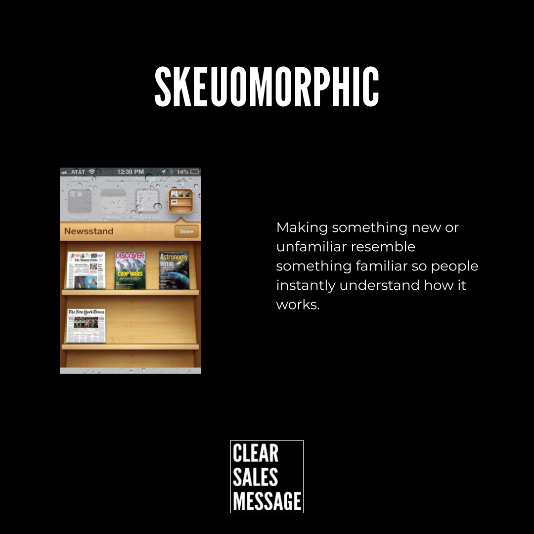
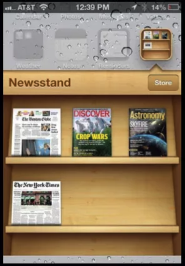
Apple’s early iOS Newsstand app used a wooden shelf for digital magazines. It still mimicked a real bookshelf, down to the wood grain and shadows. Anyone who had browsed a real newsstand instantly knew how to tap through it.
See Also