Practical Sales Training™ > Selling Communication Basics > The Arrow Effect

The Arrow Effect
Words take effort. The reader has to process them, interpret them, and decide what to do. An arrow skips all of that. It points. The brain follows. The action happens.
That’s the Arrow Effect. It’s one of the simplest tools in visual communication and one of the most underused in sales and marketing. Most people reach for more text when something isn’t clear. But often, a single arrow does the job better than a paragraph ever could.
Because arrows work across languages, cultures, and reading levels, they’re also one of the most universal communication tools available. So when you use them well, you remove friction for everyone at once.
What Is the Arrow Effect?
The Arrow Effect is the impact of using arrows as visual cues to direct attention, explain ideas, and drive action without relying on words. Arrows cut through complexity by showing people where to look, what to do, or how something flows.
Instead of explaining with text alone, you let semiotics do the work. Semiotics is the study of signs and symbols and how people interpret them. Arrows are one of the clearest examples because they carry meaning instantly, with no reading required.
Examples of the Arrow Effect include checkout pages using arrows to highlight a Buy Now button, infographics where arrows explain a step-by-step process, ads and landing pages with arrows pointing at the call to action, and onboarding screens in apps that use arrows to guide new users through a flow. In each case, the arrow replaces explanation with direction.
Why Does the Arrow Effect Work?
The brain processes images faster than words. So an arrow communicates direction before the reader has consciously registered it. That speed is what makes the Arrow Effect so powerful in high-friction moments, such as a cluttered landing page or a complex product diagram.
Arrows also carry universal meaning. Across languages and cultures, an arrow means look here, go this way, or do this next. Because no translation is needed, they work for every reader simultaneously. That universality is rare in communication, and it’s why brands like IKEA and Lego rely on arrows rather than words in their instructions.
There are four specific effects arrows create. First, instant clarity: no need to explain in text when an arrow shows the direction. Second, guided focus: arrows direct attention to the most important elements on a page or screen. Third, emotional simplicity: buyers feel less friction because they don’t have to work hard to understand. Fourth, conversion lift: research in UX and marketing shows that directional cues like arrows increase click-through and response rates. Together, these effects make arrows one of the most efficient tools in your communication toolkit.
How Can You Use the Arrow Effect In Sales?
You can apply the Arrow Effect wherever you want to reduce friction and increase clarity. Here’s where it works best.
Websites and Landing Pages
Use arrows to guide the eye to forms, buttons, or calls to action. When a visitor lands on your page, they scan before they read. So an arrow pointing at your key action tells them what to do before they’ve processed a single word. As a result, conversion rates improve because the path forward is immediately obvious.
Presentations and Sales Decks
Add arrows to emphasise data points or show the flow of information. In a presentation, the audience’s eye wanders unless you direct it. An arrow on a chart that points to the key number pulls focus instantly. Similarly, arrows connecting steps in a process show sequence without a single word of explanation.
Infographics and Diagrams
Replace long explanations with arrows that visually connect the steps. When you explain a process in text, the reader has to hold multiple steps in mind at once. However, when you use arrows to link each stage visually, the logic becomes self-evident. The reader follows the arrow rather than working through the words.
Email Campaigns
Add arrow icons to draw attention to links or next steps. Most emails have one thing they want the reader to do. So use an arrow to point at that action. Because the eye follows the arrow before it reads the surrounding text, you increase the chance the reader acts on the right thing rather than scanning past it.
Packaging and Signage
Use arrows to show how to open, use, or move through a process. Physical products often come with instructions that buyers ignore because they’re too text-heavy. An arrow showing where to press, pull, or point removes that barrier entirely. In fact, the simpler the instruction looks, the more likely someone is to follow it.
When the Arrow Effect Works Best
It works best when the content is visually complex or the desired action isn’t immediately obvious. The more a buyer has to think about what to do next, the more an arrow helps. So use it wherever hesitation is most likely to occur.
It also works well in digital environments where attention spans are short and scrolling is fast. A well-placed arrow on a landing page or email can stop the scan and redirect focus in a fraction of a second. Because the investment in adding an arrow is minimal and the potential gain is significant, it’s one of the highest-return tweaks you can make to any piece of communication.
Similarly, it’s powerful in cross-cultural or multilingual contexts. When your audience speaks different languages or has varying levels of literacy, an arrow communicates clearly to everyone. That inclusivity makes it particularly valuable in global marketing or large-scale campaigns.
When the Arrow Effect Becomes Dangerous
It becomes a problem when you use too many arrows and the effect cancels itself out. If everything has an arrow pointing at it, nothing stands out. The power of the Arrow Effect comes from directing attention to one thing. So when arrows compete with each other, they create confusion rather than clarity.
It can also misfire when the arrow points to something the viewer doesn’t want to see. An arrow draws the eye. But if it leads to a weak call to action, a confusing message, or a cluttered section of the page, it amplifies the problem rather than solving it. The arrow is only as good as what it points at.
And it can feel cheap or unsophisticated when the design is poor. A badly rendered arrow in the wrong colour or size can undermine the quality of an otherwise strong piece of communication. So the arrow itself needs to look intentional and considered, not like an afterthought.
Common Arrow Effect Mistakes
Using Too Many Arrows at Once
Arrows work by focusing attention. But when you scatter them across a page, they compete with each other and the focus disappears. Treat each arrow as a deliberate choice. Ask what the single most important action is on this page, this slide, or this email. Then point one arrow at it and remove the rest.
Pointing at the Wrong Thing
An arrow draws the eye to whatever it points at. So if that thing is weak, confusing, or irrelevant, the arrow makes the problem worse. Before you add an arrow, make sure the destination earns the attention. Fix the content first, then use the arrow to direct people to it.
Making the Arrow an Afterthought
A poorly designed arrow undermines the communication around it. Size, colour, weight, and placement all affect how the arrow reads. However, when an arrow looks rushed or out of place, it signals a lack of care. Design it with the same attention you give the rest of the page, because the viewer will judge it the same way.
Relying on Arrows Instead of Fixing the Structure
Arrows reduce friction, but they don’t fix broken communication. If a page is confusing because the layout is poor or the message is unclear, adding arrows is a sticking plaster. The Arrow Effect works best when the underlying structure is already sound. Use arrows to refine a clear message, not to rescue a confused one.
The Arrow Effect – An Example
Lego and IKEA use the Arrow Effect in their instructions to make them universally easy to follow. There are no words. Instead, arrows show exactly where each piece goes and in which direction. A child in Japan and an adult in Brazil read the same instruction sheet and follow the same steps, because the arrows do all the explaining.
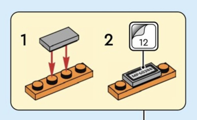
The example above shows a Lego instruction step. Two red arrows point downward, showing exactly where to press the brick into place. No caption is needed. The action is obvious. That’s the Arrow Effect at its cleanest: one visual cue, one clear action, zero friction.
See also