
Practical Sales Training™ > How People Work > Affordance

Affordance
What Is It
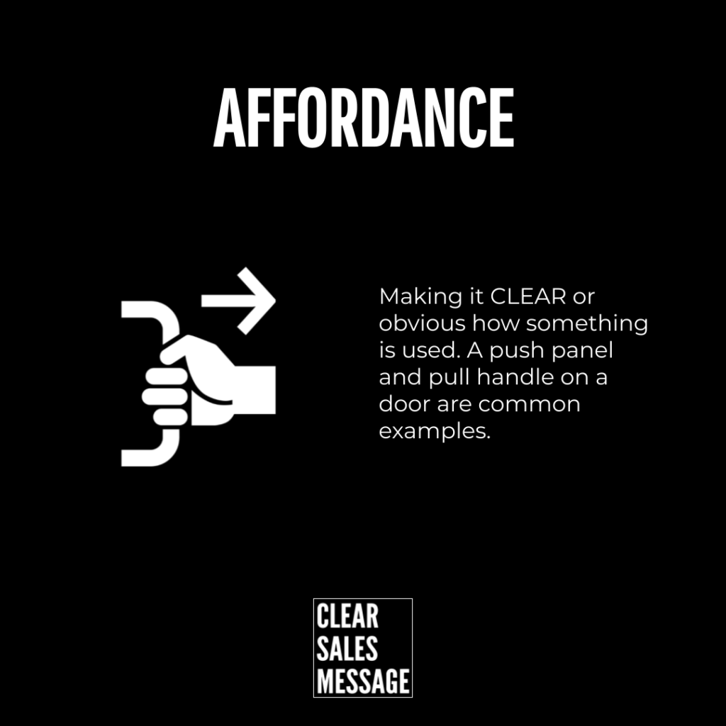
An affordance is the purpose of something. It’s the relationship between an object and what it lets you do. A door handle affords pulling, while a flat panel affords pushing. You don’t need a sign to work it out, because the design already tells you.
This matters in sales too. Your offer has an affordance of its own. A prospect looks at your page or your pitch. They form an idea of what to do next, almost instantly. If that idea is wrong, or missing, they hesitate. And hesitation kills deals.
Good design removes doubt. A big “Buy Now” button screams what to do, but a vague paragraph about “next steps” does not. That gap is the whole point of affordance. Get it right and people move. Miss it, and they freeze instead.
Why Does It Work
It works because design can speak without words. Icons do this already. So does imagery used to convey meaning. Affordance works the same way, through how something behaves rather than what it says.
Your brain reads shape, size, and position before it reads any words. That’s why a big button feels clickable and small grey text does not. This happens fast. There’s no thinking involved. Just recognition.
In selling, this matters more than most people realise. Buyers judge trust and quality first. And they do it before reading a single sentence of copy. Get the affordance wrong, and your words never get a chance to work at all.
How Can You Use It
The Three Original Types
In 1991, William Gaver defined three types of affordance. A perceptible affordance is obvious. Its shape or position tells you what to do. Think of a big red button marked “Get My Quote.” You don’t explain it. People just click.
A hidden affordance forces the buyer to hunt. They hover, click, and guess their way through your page. They’re trying to find pricing or contact details. Every second spent guessing is a second closer to leaving instead.
A false affordance is worse still. It looks clickable but isn’t. Or it promises ease your process can’t deliver. Say “instant approval,” then make someone wait three days. You’ve broken the deal before it started.
The Four HCI Types
In 2001, Rex Hartson added four more types. A physical affordance uses text on the button itself. So “Book A Call” beats a plain arrow every time. People call this an explicit affordance. It’s usually the safest choice in sales copy.
A cognitive affordance labels what happens next, like “Click here to see pricing.” Meanwhile, a sensory affordance gives feedback instead. Even a short “Thanks, we’ve got your message” does the job well. Both remove doubt at the exact moment doubt creeps in.
A functional affordance shows visible progress. An item appearing in a cart proves the action worked. In sales, that might be a confirmation screen. Or a signed contract landing in someone’s inbox. Even a simple “you’re on the list” message counts.
The UI Design Types
A pattern affordance leans on habit. That hamburger icon means menu, simply because we’ve all seen it a thousand times. On sales pages too, stick to familiar shapes for buttons and forms. Don’t get clever just for the sake of it.
A negative affordance blocks progress on purpose. Its greyed-out button stays dead until someone fills in the form. Used well, this guides a buyer through steps in order. Handled badly, though, it just feels like a wall with no explanation.
When It Works Best
Affordance earns its keep at the exact moment someone has to act. Think checkout pages, pricing tables, and contact forms. Or the final line of a proposal. These are high friction points. And clear design carries someone through them without a second thought.
It also works well the first time someone meets your business. A new visitor has no loyalty and no patience. Your homepage or opening pitch needs to signal the next step instantly. If it doesn’t, they’ll assume there isn’t one. Then they’ll move on.
When It Becomes Dangerous
Affordance turns dangerous the moment it lies. A button promising “instant access” that leads to a long form breaks trust immediately. So does language implying a simple process, when your actual process is anything but.
This damage compounds too. Once a buyer catches one false affordance, they start questioning everything else on the page. Your genuine claims get read with suspicion. All because one small signal didn’t match reality.
Common Mistakes
Making People Guess
Plenty of sales pages hide the one thing that matters most. The actual next step. A vague link buried in a paragraph is a hidden affordance. And most people won’t go looking for it. Make the action visible, not clever.
Overpromising The Click
Words like “quick”, “instant”, and “easy” set an affordance in the buyer’s mind. This happens before they’ve done anything at all. If the real process is slower, you’ve created a false affordance. And the disappointment lands on you, not the process.
Skipping The Confirmation
After someone submits a form, books a call, or signs a contract, they need proof it worked. Silence after action is a missing functional affordance. It leaves people wondering whether to try again. Or simply walk away.
Affordance – An Example
Push And Pull, In Sales Terms
The simplest example of affordance is a push and pull door handle. Design alone tells you what to do. No instruction needed, no words required. Your sales message should aim for exactly this. One glance, one clear action, zero confusion.

Think about your own pricing page or proposal document. Does the layout point somewhere specific? Or does someone have to read three paragraphs first? The door handle never makes anyone read anything before they act.
See also