

Practical Sales Training™ > Selling Communication Basics > Kerning
Kerning
A tiny gap in the wrong place can change a whole word. So spacing matters more than most people realise.
Kerning is the space between letters. So get it wrong, and readable text can turn into something else entirely.
What Is It
Kerning means adjusting the space between letters so text reads correctly. So get it right, and nobody notices. Get it wrong, and everyone does.
Badly kerned text can look unintentionally rude or simply confusing. Since first impressions form fast, that’s rarely the impression you want to make.
Why Does It Work
We recognise words by scanning letter shapes, not reading letter by letter. So if spacing shifts, our brain can form the wrong word entirely.
That mistake costs you twice. Since buyers miss your message, and your brand takes a small hit too.
Here’s a well known example of how flexible our reading really is.
fi yuo cna raed tihs, yuo hvae a sgtrane mnid too. Cna yuo raed tihs? Olny 55 plepoe out of 100 can.
i cdnuolt blveiee taht I cluod aulaclty uesdnatnrd waht I was rdanieg. The phaonmneal pweor of the hmuan mnid, aoccdrnig to a rscheearch at Cmabrigde Uinervtisy, it dseno’t mtaetr in waht oerdr the ltteres in a wrod are, the olny iproamtnt tihng is taht the frsit and lsat ltteer be in the rghi t pclae. The rset can be a taotl mses and you can sitll raed it whotuit a pboerlm. Tihs is bcuseae the huamn mnid deos not raed ervey lteter by istlef, but the wrod as a wlohe. Azanmig huh? yaeh and I awlyas tghuhot slpeling was ipmorantt!
How Can You Use It
So be careful with your spacing, especially around your own brand name. Check it doesn’t accidentally combine into something else.
Look closely at any word your letters might accidentally form. Since your eyes adjust to it, a fresh pair often spots what you can’t.
When It Works Best
This matters most on anything large, printed or permanent, like signage. So a mistake that’s easy to miss on screen becomes obvious at size.
It also matters for your own name or logo. Since that’s the one piece of text people see the most, again and again.
When It Becomes Dangerous
It becomes dangerous when the accidental word is embarrassing rather than harmless. So the mistake becomes the story, instead of your actual message.
It’s worse still when it’s printed or installed somewhere permanent. Since fixing a sign costs far more than fixing a document.
Common Mistakes
Not Checking At Different Sizes
Some businesses never check their spacing at different sizes. So text that reads fine small can combine badly once it’s enlarged.
Not Getting A Second Pair Of Eyes
Some rely only on their own eyes to catch mistakes. So a second person, seeing it fresh, spots the issue they missed entirely.
Dismissing It As A Minor Detail
Some dismiss spacing as a minor detail not worth the effort. So a small gap ends up defining the whole first impression.
Kerning – An Example
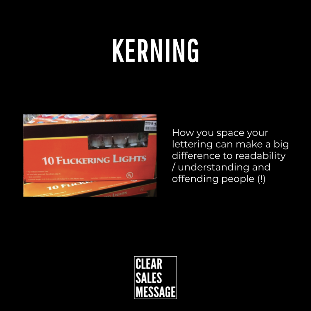
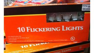
These Are Flickering Lights, Apparently
These are flickering lights. Apparently.
See also