Practical Sales Training™ > How To Get Attention > Alert Bar

Alert Bar
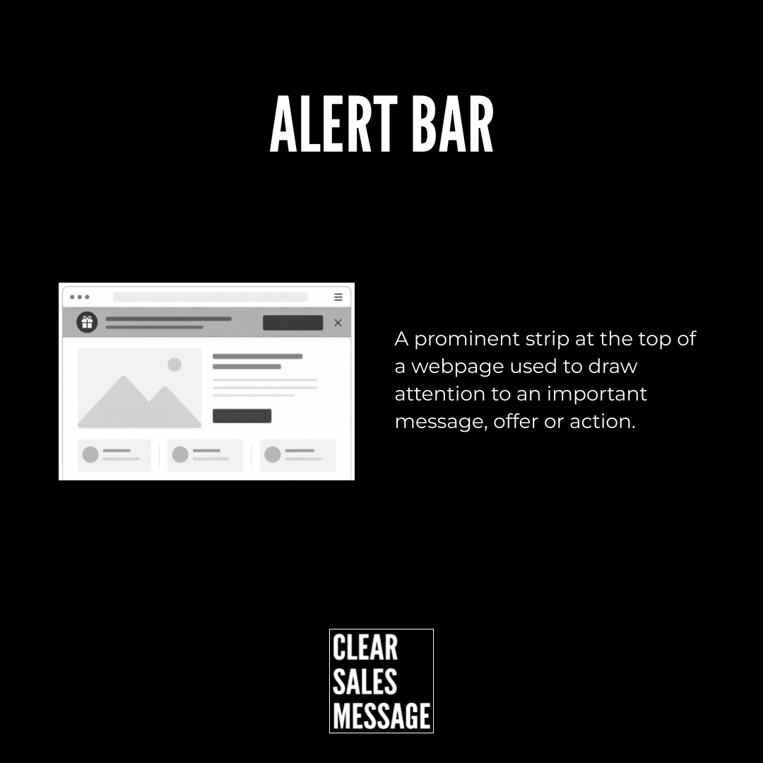
An alert bar sits across the very top of a webpage. It holds one short message, offer, or action. So every visitor sees it before anything else on the page.
You’ve seen this a hundred times without noticing the name for it. A free shipping threshold, a sale countdown, a single line announcing a new product. That’s the alert bar doing its job.
Why Does It Work
Position matters more than most people realise. The top of a page is the first thing anyone reads. So an alert bar gets read before the headline, the menu, or anything else competing for attention.
It also works because it’s unmissable. A banner buried mid-page can get scrolled past. This one sits directly in the visitor’s path instead.
Simplicity helps too. An alert bar usually holds one line. There’s nowhere for a message to hide, so it lands instantly.
How Can You Use It
Say one thing, clearly
Use the space for a single message. A shipping threshold, a sale deadline, a new product. So cramming in more than one idea dilutes all of them.
Make the offer specific
A vague “great deals inside” says nothing at all. An exact shipping threshold gives the visitor a real reason to keep browsing.
Give it somewhere to lead
Link the bar to the page that actually delivers on the message. A visitor who clicks an offer and lands somewhere unrelated loses trust fast.
When It Works Best
This works best for time-limited offers and site-wide announcements. Free shipping thresholds and sale countdowns fit naturally into one line. So do new product launches.
It also helps most on the homepage and category pages. Most visitors land there first. So a message buried three clicks deep barely gets seen at all.
When It Becomes Dangerous
An alert bar that never changes stops working. Visitors filter it out fast, the same way they filter out a familiar advert.
It also becomes a problem if it hides real content. On phone screens, an oversized bar can push the page below the fold. Visitors scroll right past the message that mattered.
Common Mistakes
Leaving it up after the offer ends
An expired offer in an alert bar damages trust immediately. So remove or update it the moment the deadline passes.
Making it too tall or too loud
An oversized bar competes with your own page for attention. Keep it thin enough that it informs without shouting instead.
Forgetting a close button
Some visitors want the extra space back once they’ve read the message. A missing close button turns a helpful strip into a nuisance.
Alert Bar – An Example
Skims online store
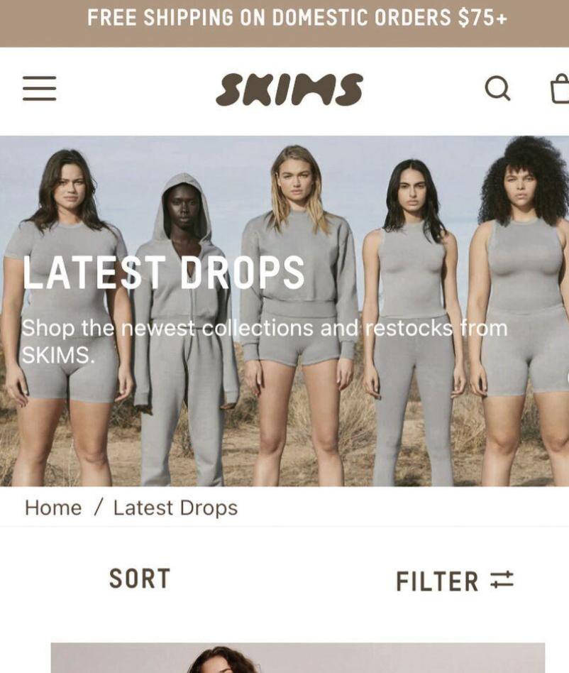
Skims uses this well. Their alert bar sits right at the top of the store. It states a free shipping threshold before a visitor sees a single product.
See Also