Practical Sales Training™ > Wordplay > Ambigram
Ambigram
Most logos get one chance to make an impression. An ambigram gets two – because it works right side up and upside down.
That is not a gimmick. It is a genuine attention tool. When something looks the same no matter how you turn it, people notice. They show others. They take photos. And because of that, your brand travels further than a standard design ever would.
Ambigrams are rare in commercial use, which is exactly why they work so well. In a world of predictable branding, something that defies expectation stops people in their tracks.
What Is An Ambigram?
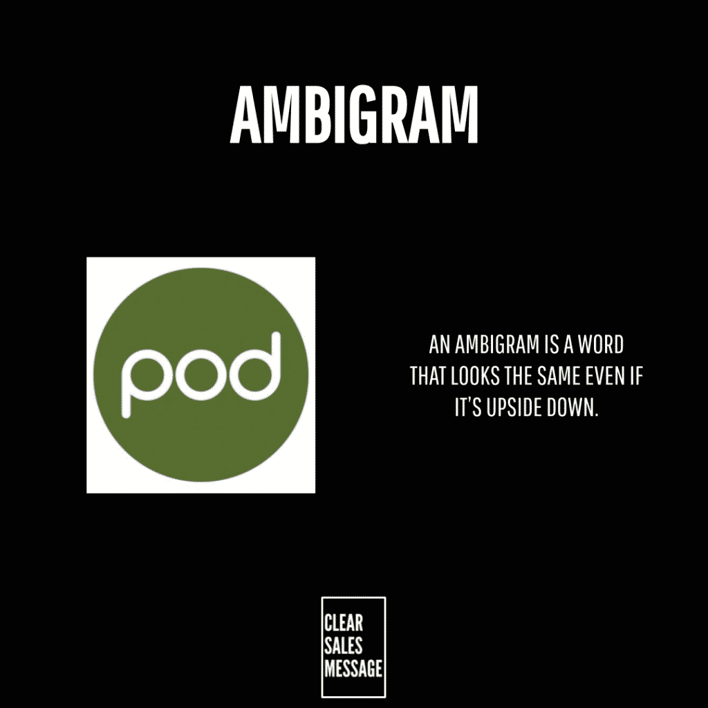
An ambigram is a word or phrase that reads the same when you flip it upside down. A skilled designer crafts each letter to map to another at 180 degrees, while keeping the whole word legible from both orientations.
The word “WOW” is the most famous natural example – turn it upside down and it still reads “WOW.” However, most ambigrams do not happen by accident. A designer needs to shape each letter carefully so the symmetry works without losing clarity.
Some ambigrams go further and show two different words depending on which way up you hold them. For example, one orientation might read “life” and the other “death.” That kind of contrast makes for very powerful visual storytelling in the right context.
Why Does An Ambigram Work?
An ambigram catches the eye in a way that standard text simply cannot. When something behaves in an unexpected way, the brain pays attention. So a logo or tagline in ambigram form commands a second look before the viewer even knows why.
It also creates a sense of craft. A well-made ambigram signals that serious thought went into the design. As a result, it lifts the perceived quality of the brand around it – especially in premium or creative markets where presentation matters.
Similarly, ambigrams are inherently shareable. When someone spots that a word reads the same upside down, they want to show someone else. That social impulse turns a piece of branding into a conversation starter – and in turn, into free word-of-mouth marketing.
Finally, an ambigram stays legible in every situation. Whether the logo appears on signage, packaging, an animated screen, or a product someone picks up and turns around, it works. That consistency is a practical advantage as much as a visual one.
How Can You Use An Ambigram In Sales?
Use it as your brand name or logo
The most powerful application is your business name itself. If your name – or a version of it – works as an ambigram, that design becomes a permanent asset. Every time someone sees it, picks it up, or rotates it, the effect plays out again. So the brand stays active rather than passive.
Apply it to packaging or physical products
Physical products get handled. Boxes get turned around. Labels get read from different angles. An ambigram on packaging therefore gets more exposure than a standard design – and because it works from any direction, it never reads incorrectly.
Use it in event or experiential marketing
Events are a natural home for ambigrams. Guests interact with signage, invitations, and printed materials up close. An ambigram on an event invite or display gives attendees something to discover and share. That discovery moment creates a memory – and memories drive referrals.
Commission the right designer
Creating a good ambigram is not a DIY task. You need a designer who specialises in typographic work and understands how letterforms map to each other. Legibility must come first and cleverness second – because if the word is hard to read, the effect is lost. Invest in the craft, because a poor ambigram does more damage than none at all.
When An Ambigram Works Best
Ambigrams work best for brands where visual impact is part of the value. Creative agencies, event companies, luxury goods, tattoo studios, and premium retail are all natural fits. In those sectors, the design itself tells part of the brand story – so an ambigram adds meaning rather than just novelty.
They also work well for animated digital use. When a logo spins or rotates and still reads correctly at every point, it becomes far more engaging than a static image. As a result, ambigrams perform strongly in social media content, video intros, and motion graphics.
However, any business that wants to stand out can use one. Because ambigrams are so rare in everyday branding, even using one in a niche or traditional sector creates a strong point of difference.
When An Ambigram Becomes Dangerous
Legibility is the biggest risk. If the word is hard to read in either orientation, the ambigram fails its primary job. A clever design that confuses people does not help your brand – it undermines it. So always test with people who have never seen it before.
Ambigrams can also feel gimmicky if the rest of the brand does not match the level of craft. A beautifully designed ambigram sitting above cheap-looking copy or a poorly built website creates a disconnect. The design raises expectations – so everything around it needs to meet them.
Finally, not every word suits an ambigram. Some letter combinations simply do not map well enough to produce a clean result. In those cases, forcing it produces something that looks wrong even if it technically reads the same. Walk away and find a different tool instead.
Common Ambigram Mistakes
Prioritising the trick over readability
The ambigram effect impresses – but only if the word stays clear. Some designers focus so hard on making the rotation work that the letters become distorted and hard to read. Always check that someone unfamiliar with the design can read it instantly, because if they cannot, the brand suffers.
Using it without context
An ambigram on its own is a curiosity. But without a moment for the viewer to discover what it does, the effect never lands. So always create a context where the rotation shows – on packaging that gets picked up, signage that people approach, or animation that shows the flip. The discovery is the point.
Choosing the wrong word
Not every word makes a good ambigram. Words that use letters with more rotational symmetry – like o, s, x, z, n, and u – tend to work better than those built from letters like f, t, or k. So start with your word list and test the letterforms before committing to a design direction.
Treating it as a one-off stunt
An ambigram delivers most value when you embed it consistently across your brand – not use it once and forget it. The more surfaces it appears on, the more chances people have to discover it. Therefore, treat it as a core brand asset rather than a novelty feature.
Ambigram – An Example
A luxury event company uses the tagline “Always WOW” and designs it as an ambigram. When you flip it upside down, the word WOW still reads the same. So no matter which way the invitation lands on a table, the message stays clear.
They print it on event invitations, signage, and gift bags. Guests notice the effect and take photos. Those photos appear on social media, and as a result the brand gets exposure far beyond the guest list. The design does work that a standard logo never could.
The lesson is simple. A word that behaves unexpectedly creates a moment. And moments are what people share.
See Also