Practical Sales Training™ > How To Get Attention > Directional Typography

What is it?
Directional typography is the use of angled, curved, or repositioned text to guide the reader’s eye and grab attention. Instead of keeping every line perfectly horizontal, you tilt, stretch, or shape the words so they move. This small shift breaks the predictable layout and makes the message feel more dynamic, modern, and energetic. It’s not about making the text unreadable, it’s about creating visual motion that draws people in.
How does it work?
Our eyes are drawn to movement and difference. When everything else on a page or screen is neat and flat, a single word that’s slanted or flowing in another direction naturally stands out. It signals energy, change, and intent. Directional typography uses visual rhythm to control how a viewer reads the message. For example, text that leans forward feels fast and urgent, while text that rises diagonally can feel aspirational or positive. The direction shapes the emotion.
How can you use it?
Use directional typography to highlight key words, guide reading flow, or add a sense of personality to your visuals.
-
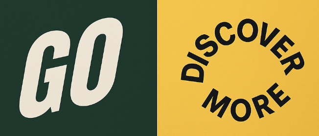
Slant for speed: A forward tilt makes words feel urgent and energetic. Perfect for action-driven messages like “Go,” “Now,” or “Accelerate.”
-
Curve for curiosity: Wrap text around images or paths to create a sense of motion and discovery.
-
Rise for optimism: Diagonal upward text suggests progress or growth.
-
Drop for drama: A downward angle creates tension or emphasis, useful for bold statements or warnings.
-
Contrast for focus: Mix one directional element with straight text to spotlight what matters most.
When used with intention, directional typography doesn’t just decorate the words, it drives them. It turns text into movement and movement into attention.
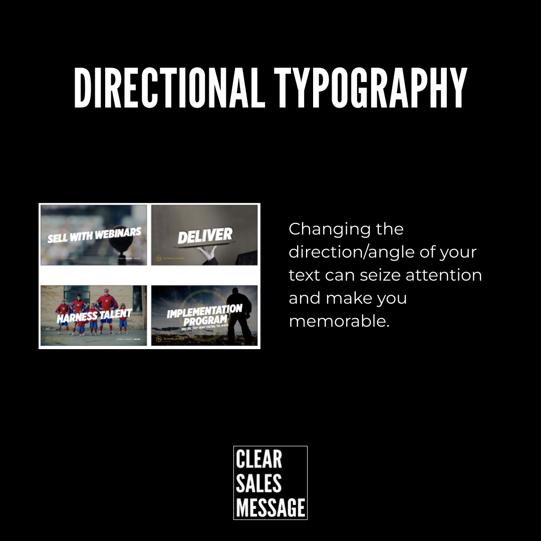
Example
Changing the direction of the text makes it more “interesting” and seizes your attention.
See also