Practical Sales Training™ > Wordplay > UPPER / lowercase names

UPPER / lowercase Names
Before a buyer reads your tagline, your price, or your offer, they see your name. And the way that name looks sends a signal. Not a loud one. But a real one.
Writing a name in lowercase feels different from writing it in UPPERCASE. Both break the convention of standard title case. So both stand out. But they stand out in completely different directions.
This isn’t a grammar decision. It’s a branding one. And because it affects every single place your name appears, it’s worth making deliberately.
What Are UPPER / lowercase Names?
Lowercase and uppercase names are branding choices where a company, product, or person deliberately presents their name entirely in lowercase or uppercase letters. This isn’t about grammar rules. It’s about style, tone, and how the name feels when people see it.
Lowercase brands include adidas, intel, flickr, airbnb, and ebay. Uppercase brands include IKEA, H&M, LEGO, and IBM. In each case, the choice is intentional. Because it shapes how the brand is perceived before a single word of copy is read, it becomes part of the brand identity itself.
Both approaches break away from standard title case. So both create a visual distinction that makes the name more memorable. However, they do it in very different ways and for very different reasons.
Why Do UPPER / lowercase Names Work?
They work because typography changes perception. The way a name looks on the page influences how it is received, often before the reader has consciously processed it.
Lowercase feels casual, approachable, and modern. It creates a sense of friendliness and simplicity. As a result, brands that want to feel human, accessible, or creative often choose it. Uppercase, on the other hand, feels bold, strong, and authoritative. It creates a sense of confidence and impact. So brands that want to project power, tradition, or global scale tend to go that route.
The choice signals brand personality. Lowercase suggests relaxed creativity. Uppercase suggests strength and permanence. Both make a brand stand out, but each one attracts a different kind of buyer and sets a different kind of expectation.
How Can You Use UPPER / lowercase Names In Sales?
You can use lowercase or uppercase naming as part of your brand identity to create the right impression. Here’s how different businesses use it.
Startups and New Brands
Lowercase works well for startups because it feels innovative, youthful, and human. It signals that a brand doesn’t take itself too seriously. For example, airbnb and tumblr both use lowercase to feel approachable and fresh. Because the convention in many industries is to use title case or uppercase, lowercase immediately positions a new brand as different.
Established and Global Brands
Uppercase works well for brands that want to project trust, authority, and scale. LEGO, IKEA, and IBM all use it. Because uppercase letters take up more visual space, they feel louder and more permanent. So for a brand that wants to convey reliability and presence, uppercase is a natural fit.
Creative Industries
Lowercase has a strong association with minimalism and design-led thinking. In creative sectors like tech, fashion, and media, it signals that the brand has a considered aesthetic. As a result, it attracts buyers who value style and originality alongside the product itself.
Retail and Consumer Goods
Uppercase makes a name feel louder and more memorable in crowded retail environments. When a name appears on packaging, signage, or a shop front, uppercase letters are easier to read at a distance. So for consumer goods brands, uppercase often performs better in physical environments than lowercase does.
Tips for Success
Make sure the choice matches your brand voice. Don’t use uppercase if you want to feel soft and personal. Apply the style consistently across your logo, website, and all materials. Also, test how the name looks in different contexts, from business cards to social media feeds. Because a choice that looks strong in a logo may read differently in a small email footer.
When UPPER / lowercase Names Work Best
They work best when the choice is made deliberately and applied consistently. A brand that uses lowercase in its logo but title case everywhere else sends a confused signal. However, a brand that commits to lowercase across every touchpoint builds a visual identity that feels coherent and considered. Consistency is what turns a typographic choice into a brand asset.
They also work well when the choice aligns with the target audience’s expectations. A fintech startup targeting young professionals will benefit from lowercase. A global law firm, however, will benefit from uppercase. So the question isn’t which looks better in isolation. It’s which one fits the buyer you’re trying to attract.
Similarly, the technique works well when the name itself suits the treatment. Short names in uppercase feel punchy and strong. Longer names in uppercase can feel heavy and hard to read. Lowercase works best for names that are already distinctive. Because a generic name in lowercase just looks like it wasn’t capitalised properly.
When UPPER / lowercase Names Become Dangerous
They become a problem when the choice contradicts the brand’s actual personality. A luxury brand that uses playful lowercase creates a mismatch. The typography signals one thing and the product signals another. As a result, buyers feel a disconnect they can’t always name, but that still affects their confidence in the brand.
Lowercase can also be misread as a mistake. In formal documents, email signatures, or professional contexts, a lowercase brand name sometimes looks like a typo rather than a design choice. So if you use lowercase, make sure the context makes the intentionality clear. A well-designed logo helps. A lowercase name typed in the middle of a plain email doesn’t always land the same way.
And uppercase can feel aggressive or old-fashioned in the wrong context. When everything is capitalised, it can feel like shouting. So in conversational or community-driven channels, uppercase branding can work against the warm tone you’re trying to set.
Common UPPER / lowercase Name Mistakes
Applying It Inconsistently
The most common mistake is choosing a case style for the logo but then ignoring it in copy, social posts, and email. Inconsistency dilutes the effect. Because the signal only works when it’s consistent, every instance of the brand name needs to follow the same rule. That requires a clear brand guideline and the discipline to apply it everywhere.
Choosing Based on Aesthetics Alone
Lowercase looks clean and modern in isolation. Uppercase looks bold and strong. But the right choice isn’t the one that looks best on a white background. It’s the one that best fits the brand’s personality, audience, and context. So before you decide, ask what signal you want to send, not just what looks good in the logo design software.
Ignoring Readability
Long names in all uppercase are harder to read than those in title case. Similarly, lowercase names in small sizes can be harder to distinguish from surrounding text. So always test readability at the sizes and in the contexts where the name will actually appear. Because a name that’s hard to read is a name that’s hard to remember.
Changing It After Launch
Switching from lowercase to uppercase or vice versa after a brand has launched creates confusion. Buyers who already know the brand have to relearn how the name looks. So the decision is worth getting right before you go public. Because changing a typographic style mid-brand is expensive, disruptive, and rarely necessary if the original choice was made deliberately.
UPPER / lowercase Names – An Example
The image below shows a grid of well-known brand logos. On the left, lowercase brands like adidas, airbnb, android, facebook, and nutella all feel approachable and modern. Their lowercase names signal friendliness and accessibility. On the right and throughout, uppercase brands like IKEA, IBM, and H&M feel bold and authoritative. Their names signal scale and permanence.
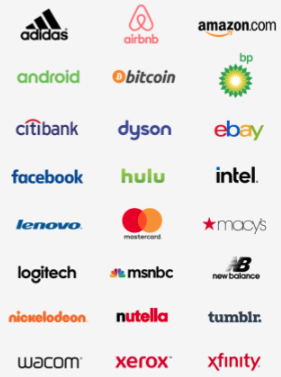
Both approaches work. But they work for different brands, different audiences, and different messages. The key is that every brand in the grid made a deliberate choice. None of them arrived at their typographic style by accident. As a result, the name itself has become part of the brand. And that’s exactly what a well-used case choice should do.
See also