Practical Sales Training™ > How To Convert > Price Difference
Price Difference
Nobody wants to feel the full weight of a price tag. So smart businesses stop showing it.
Instead they show the gap. A few pounds more for the next size up. A few pounds less for the smaller one. Suddenly the decision feels light, even though the total is exactly the same.
What Is Price Difference?
Price difference is the gap between two or more options, like sizes, tiers, or competitor offers. Instead of showing the full price for each one, many businesses show how much more or less something costs compared to a base price.
It’s a pricing strategy used to guide decisions, add clarity, and highlight value. And it works because people find small numbers far easier to accept than big ones, even when the maths ends up the same.
Why Does It Work?
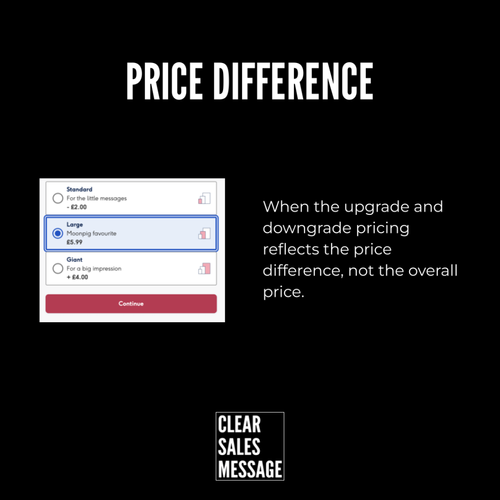
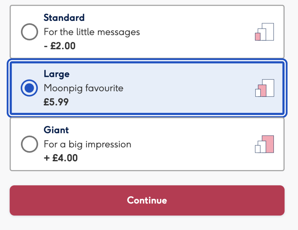
Rather than listing every price outright, this model shows a base price, then other options as a plus or minus against that base. A standard size might show as minus £2.00. A large might be the base price at £5.99. A giant might show as plus £4.00.
This uses relative pricing to help buyers compare quickly. It frames an upgrade as a small, easy step, and a downgrade as something you’d be giving up. So the upgrade feels justified, while the smaller option feels like a loss.
Businesses often pair this with anchoring too, placing the “best value” option in the middle. That middle spot quietly becomes the one most people choose, since it looks reasonable next to both extremes.
How Can You Use Price Difference?
Improve Conversions
Show the relative value of each option instead of the full price. Buyers upgrade more often when the extra cost feels like a small step rather than a big jump.
Highlight The Best Option
Add a label like “Most Popular” or “Best Value” to the middle option. This anchors your buyer’s attention around the price point you actually want them to choose.
Reduce Price Objections
Skip displaying the full price outright, and buyers feel less sticker shock. Their focus shifts to what they gain or lose, rather than the number itself.
Make Pricing More Visual
Add icons, sizes or colours to your pricing table. This makes comparison faster and reduces the mental effort your buyer needs to choose.
When It Works Best
This works best on pricing pages with three or more tiers, since the plus and minus framing needs something to compare against. A single flat price has nowhere to hide the gap.
It’s especially effective when your upgrade genuinely offers strong extra value, because the small relative price makes that value feel like an easy yes rather than a stretch.
When It Becomes Dangerous
This tactic backfires the moment a buyer works out the real total and feels tricked. If your “small” plus £4.00 actually adds up to a price they wouldn’t have chosen upfront, trust takes a hit, and it takes a hit fast.
It also becomes risky in industries where buyers expect full transparency, like healthcare or finance. Hiding the true cost there can feel less like clever framing and more like deception.
Common Mistakes
Hiding The Total For Too Long
If a buyer has to hunt for the actual total, frustration builds fast. Show the relative price, but make the full total easy to find if someone wants it.
Making The Gaps Feel Manipulative
Rounding a plus £3.87 to “just a little more” stretches honesty too far. Keep the framing persuasive, but keep the numbers accurate.
Overcomplicating The Comparison
Too many tiers with too many pluses and minuses just confuses buyers instead of guiding them. Three options usually works better than six.
Price Difference – An Example
Moonpig’s Card Upgrade Pricing
Moonpig shows the price difference for upgrading or downgrading a card, rather than the full price of each option. That framing softly distorts how much a buyer feels they’re actually spending, since a small plus sign reads very differently to a full price tag.
See Also
- The Price Per Use Effect
- Was / Now Price
- Completion Cue
- 180+ ways to improve conversion
- 40+ ways to increase buyer spend