Practical Sales Training™ > How To Lose The Sale > Amateur Graphics
Amateur Graphics
What Is It
Amateur Graphics is what happens when your branding looks homemade instead of professional. Clashing colours, mismatched fonts, stretched logos and cluttered layouts all count.
None of it is about your product. It’s about how your business looks before anyone reads a word.
Why Does It Work
Buyers use visual quality as a shortcut for trust. If your graphics look rushed, they assume the rest of your business might be rushed too. That’s not fair, but it’s how most people think.
This is the halo effect working against you instead of for you. A polished, consistent look makes people expect a polished service. A messy one makes people expect missed deadlines and awkward support calls. Nobody says this out loud. But it still shapes the decision.
How Can You Use It
Fix The Three Things Buyers See First
Don’t try to overhaul everything at once. Buyers notice your logo, your main colour and your primary font before anything else. Get those three consistent across your website, your emails and your proposals, and most of the damage disappears straight away.
Borrow One Real Template Instead Of Guessing
You don’t need a design degree to fix this. Pick one well designed page from a business you respect and copy its structure, not its content. Match the spacing, the hierarchy and the restraint, then drop your own words and images in.
Cut Before You Add
Most amateur graphics fail from too much, not too little. Too many colours, too many fonts, too many boxes competing for attention. Before adding anything new, remove one element from every page you own and see how much cleaner it feels.
When It Works Best
Amateur graphics do the most damage the first time someone sees you. Cold outreach, a first website visit and a proposal document all carry more weight than they should. That first look sets the mood for everything you say after it.
It also matters more in competitive markets, where a buyer is comparing you side by side with someone else. Two similar offers, one polished and one rough, and the polished one wins the benefit of the doubt every time.
When It Becomes Dangerous
It becomes properly dangerous once your price goes up. A rough graphic on a low cost offer barely registers. The same rough graphic next to a high price tag creates a mismatch buyers notice immediately, and mismatches make people suspicious.
It’s also dangerous in technical or high trust sales, where buyers are actively looking for reasons to rule you out. A sloppy graphic gives them an easy, visible reason to walk, before they’ve even asked you a real question.
Common Mistakes
Treating Colour And Type As An Afterthought
Too many colours, clashing shades and five different fonts on one page are the fastest way to look amateur. Add all caps everywhere, heavy bold and random underlining, and it stops looking considered altogether. Buyers don’t consciously count your fonts. But they feel the mess even when they can’t name it.
Cramming Everything Onto One Page
No white space, uneven margins and boxes touching each other make a page feel chaotic before anyone reads a word. Add ten different elements all fighting for attention, and nothing stands out. When everything shouts, buyers hear nothing clearly.
Mixing Image And Icon Styles
Blurry photos, stretched logos and flat icons sitting next to 3D ones all send the same signal, nobody was checking. Stock photos that clearly don’t match your actual business make it worse, since buyers can spot a generic photo in seconds.
Amateur Graphics – An Example
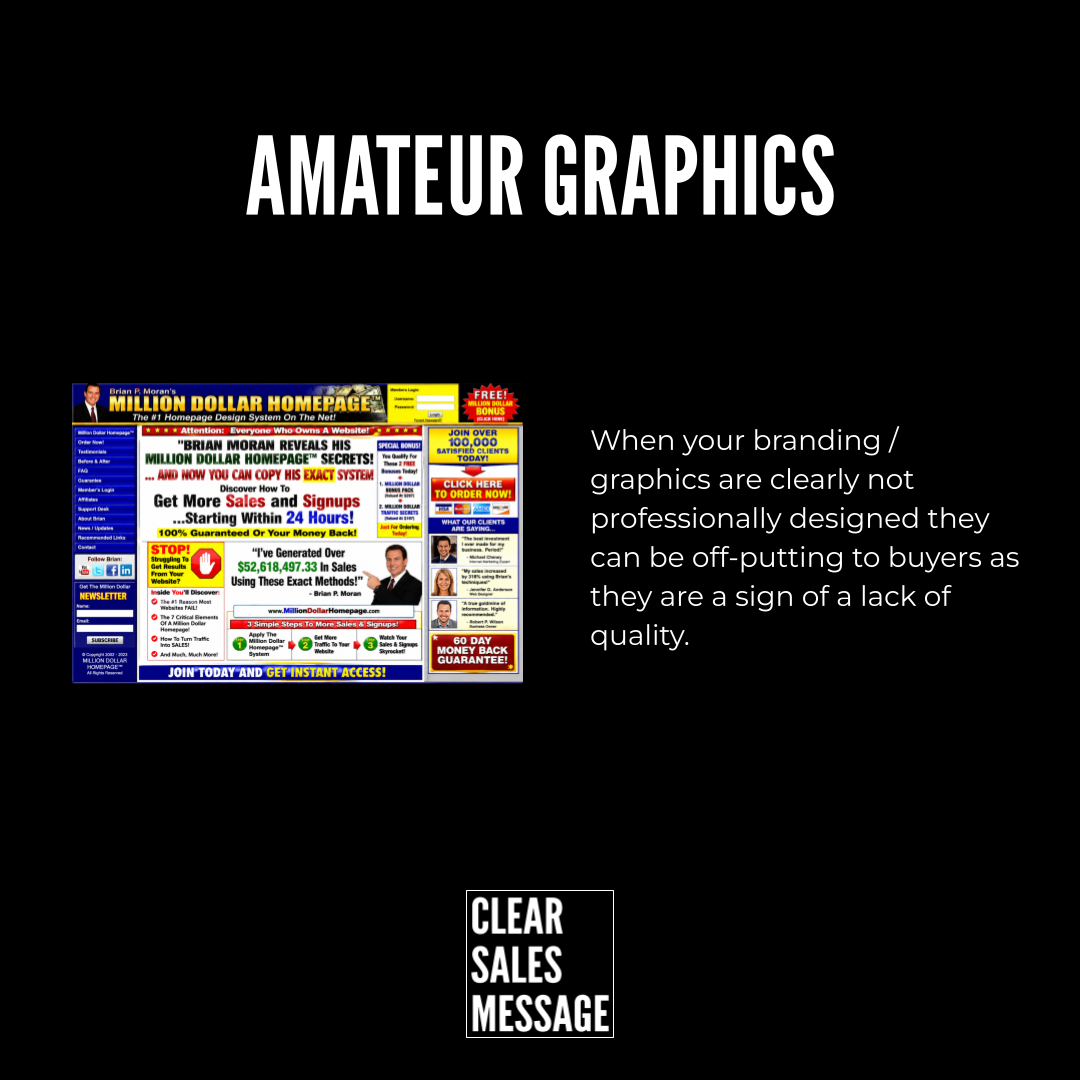
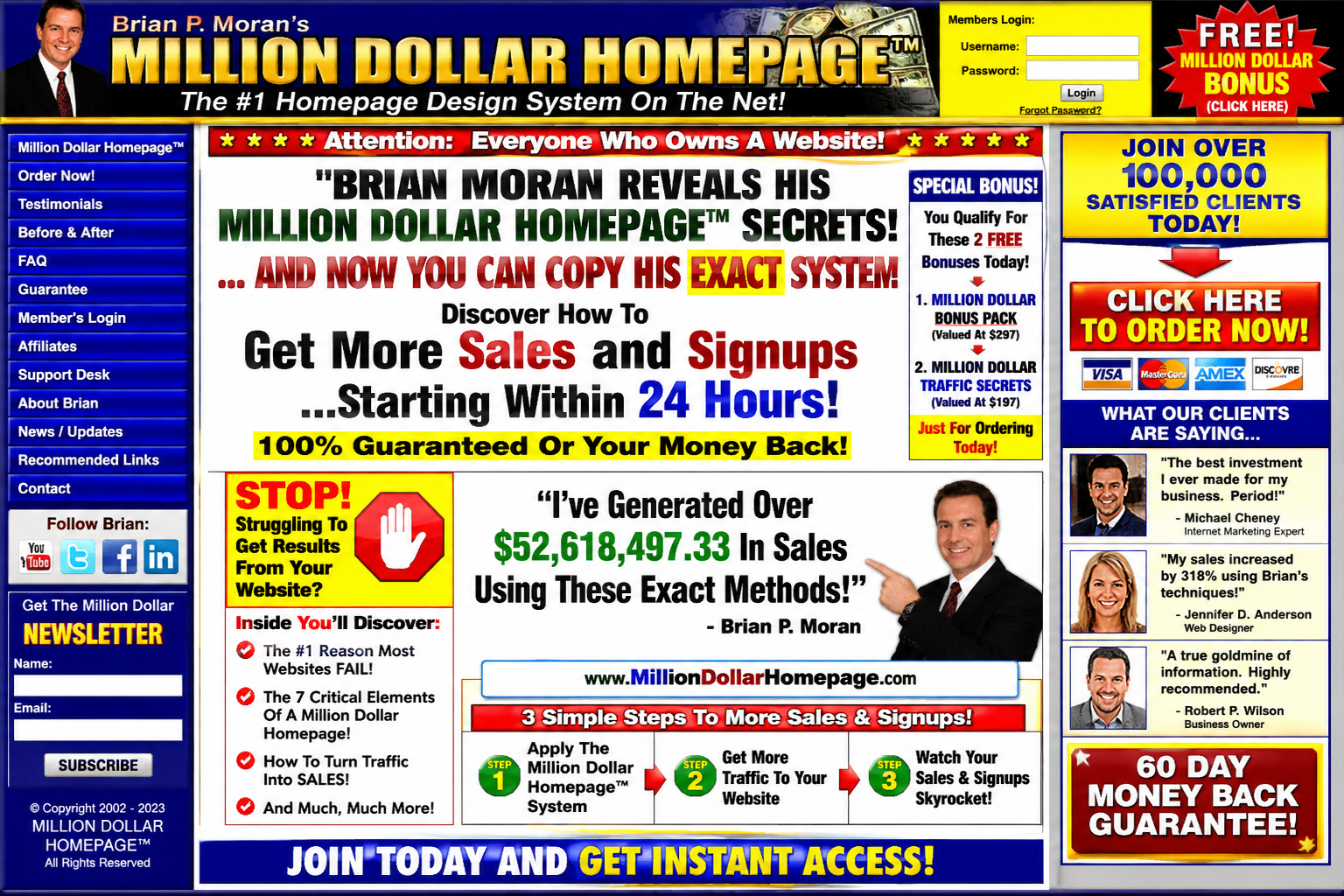
You’ll recognise this style from old, aggressive sales pages built in the early web era. Every bright colour available at once, five fonts on one screen, flashing banners and testimonials stacked on top of guarantees stacked on top of urgency countdowns.
It sold through sheer aggression once, back when buyers hadn’t seen enough of it to feel tired. It wouldn’t get a second look from a buyer today. If anything, it now signals the exact opposite of what it was trying to say.
See also:
- 60+ ways to LOSE the sale
- The Stock Photo Problem
- The Cropped Effect
- Bad Automaton Effect
- The Outdated Effect