
Practical Sales Training™ > How To Get Attention > The Typography Effect
What is it?
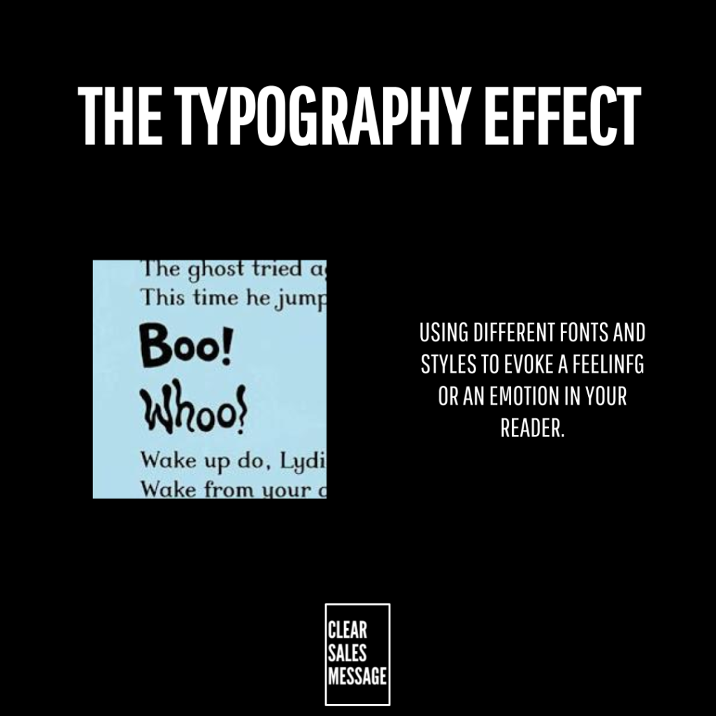
If you want to get your reader to literally behave differently (see what I did there) , then using different fonts and visualising text in different ways can work very well.
Why does it work?
It works because like semiotics (using images to convey a message) how text appears can change how we read it. From SHOUTING in all caps to “wobbly” letters that make you “wobble” your voice, there are a handful of ways to get your readers more engaged in your message by changing their physiology and how they read the words you’ve written.
How can you use it?
Whether it’s a social media post or an advert – or even your signage or packaging, consider the typography and fonts you use to get your point across. DO you want to be fun? serious? professional? casual? Whist you might have a set font as part of your branding guidelines, changing one word for emphasis can make or break how your message is understood, interpreted and even (literally) read.
Example
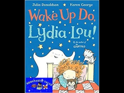
An example of this can be found here in the reading of a children’s book which uses different typography.
See also