

Practical Sales Training™ > How To Get Attention > The Typography Effect
The Typography Effect
What Is It
If you want your reader to literally behave differently, using different fonts can work very well. So can visualising text in different ways.
That pun was deliberate. The Typography Effect is exactly what just happened to your reading.
The way text looks can change how you physically read it. Not just what you understand from it.
Why Does It Work
It works because, like semiotics, how text appears can change how we read it. Using images to convey a message is one example.
From SHOUTING in all caps to “wobbly” letters that make you “wobble” your voice. There are a handful of ways to get readers more engaged.
You do this by changing their physiology. You change how they physically read the words you’ve written.
A shouted word gets read louder in your head, even in silence. A stretched word gets read slower. The shape itself carries meaning before the letters even do.
How Can You Use It
Consider your typography across every touchpoint
Whether it’s a social post, an advert, or your signage or packaging, think about the typography you use. Consider how it helps get your point across.
Ask what tone you actually want
Do you want to be fun? Serious? Professional? Casual? Each choice changes how the same words land.
Bend the rule for a single word, not the whole message
You might have a set font as part of your branding guidelines. But changing one word for emphasis can make or break how your message gets understood, interpreted, and even physically read.
When It Works Best
This works best on short, punchy moments. Headlines, taglines, single words you want to land differently to the rest.
It also works best when it matches the meaning of the word itself. A shaky font on the word “wobble” reinforces the idea. A shaky font on an unrelated word just looks like a mistake.
When It Becomes Dangerous
It backfires if it’s overused across an entire piece of text. Constant typographic tricks tire the eye and stop meaning anything specific.
It also becomes risky if it hurts basic readability. A clever font that’s genuinely hard to read loses the message it was meant to enhance.
Using it somewhere serious can undercut your tone too. Playful typography can clash badly with a message meant to be taken seriously.
Common Mistakes
Applying it to every word instead of one
Applying it to every word instead of just one dilutes the whole effect. Save it for the single word or phrase that matters most.
Choosing style over readability
Choosing a font so stylised it becomes hard to read defeats the entire purpose. Readability always comes first.
Using it in the wrong tone of context
Using playful typography in a serious or formal context can clash badly with the tone you actually need.
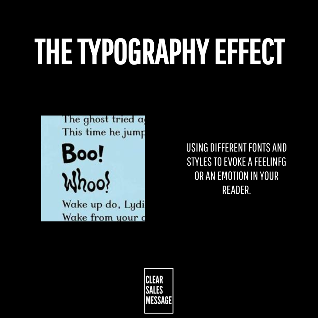
The Typography Effect – An Example
A Children’s Book Reading
An example of this can be found in the reading of a children’s book that uses different typography throughout.
Watch how the reader’s voice naturally follows the shape of the words on the page, without ever being told to.
See also