Practical Sales Training™ > How To Get Attention > Unicode
Unicode
Scroll through any feed and most text looks the same. Same font, same weight, same everything. Then one post looks different, and your eye stops on it before you even read the words.
That’s Unicode font styling at work. It’s a quiet way to stand out in a crowded feed, and it costs you nothing but a copy and paste.
What Is Unicode Font Styling?
Unicode font styling is a technique that uses special characters from the Unicode standard to change how your text looks. No images. No custom code. Just different characters doing the work.
These aren’t real fonts like Arial or Times New Roman. They’re lookalike characters pulled from across the Unicode spectrum, used to turn ordinary text into styles like:
- 𝘪𝘵𝘢𝘭𝘪𝘤
- 𝗯𝗼𝗹𝗱
- ⓒⓘⓡⓒⓛⓔⓓ
- 𝒸𝓊𝓇𝓈𝒾𝓋𝑒
- 🅑🅞🅧🅔🅓
- 𝙈𝙊𝙉𝙊𝙎𝙋𝘼𝘾𝙀
These characters work in social media bios, post headlines, email subject lines, and even button text. And they make your message stand out instantly, without any extra effort.
Why Does It Work?
Unicode is a global standard with over 140,000 characters. Most people only ever use the basic Latin alphabet, but there are dozens of stylistic alternatives that look like bold or italic text. They aren’t formatting though. They’re entirely separate characters.
For example, the normal letter A sits at U+0041. The bold version (𝐀) sits at U+1D400. The italic version (𝐴) sits at U+1D434. The script version (𝒜) sits at U+1D49C. Each one is its own distinct character, not a style applied to the same letter.
These characters work across most modern devices, browsers and platforms. Used sparingly, they stop the scroll, emphasise your key message, and add contrast to a page. They look different enough to get noticed, but they don’t look spammy if you use them well.
How Can You Use Unicode Fonts?
Headlines That Pop
Make your posts and landing pages visually distinct straight away.
🆃🅷🅴 🅲🅻🅴🅰🆁 🆂🅰🅻🅴🆂 🅼🅴🆂🆂🅰🅶🅴™
𝙎𝙩𝙖𝙣𝙙 𝙊𝙪𝙩. 𝙂𝙚𝙩 𝙇𝙚𝙖𝙙𝙨. 𝙎𝙚𝙡𝙡 𝙈𝙤𝙧𝙚.
Social Media Bios And Captions
Use a bold or stylised font to draw the eye straight to your bio.
𝗛𝗲𝗹𝗽𝗶𝗻𝗴 𝘆𝗼𝘂 𝗰𝗹𝗲𝗮𝗿 𝘂𝗽 𝘆𝗼𝘂𝗿 𝘀𝗮𝗹𝗲𝘀 𝗺𝗲𝘀𝘀𝗮𝗴𝗲™
𝒯𝒶𝓁𝓀 𝓁𝑒𝓈𝓈. 𝒞𝓁𝑜𝓈𝑒 𝓂𝑜𝓇𝑒.
Email Subject Lines That Get Opened
A stylised subject line stands out in a crowded inbox before your buyer even opens it.
𝙒𝙖𝙣𝙩 𝙢𝙤𝙧𝙚 𝙘𝙡𝙞𝙘𝙠𝙨? 𝗧𝗿𝘆 𝘁𝗵𝗶𝘀 𝗳𝗶𝗿𝘀𝘁.
ⓈⓉⓄⓅ ⓁⓄⓈⒾⓃⒼ ⓈⒶⓁⒺⓈ ⓉⓄ ⒸⓄⓃⒻⓊⓈⒾⓄⓃ
Buttons And Calls To Action
Highlight your action without needing a designer to touch it.
[𝗚𝗲𝘁 𝗦𝘁𝗮𝗿𝘁𝗲𝗱]
[𝓓𝓸𝔀𝓷𝓵𝓸𝓪𝓭 𝓝𝓸𝔀]
Lead Magnets, Checklists And Titles
Add a premium feel to a downloadable asset, since a stylised title alone can lift perceived value.
𝟯𝟯 𝗪𝗮𝘆𝘀 𝘁𝗼 𝗖𝗹𝗲𝗮𝗿 𝗨𝗽 𝗬𝗼𝘂𝗿 𝗦𝗮𝗹𝗲𝘀 𝗠𝗲𝘀𝘀𝗮𝗴𝗲
🄲🄷🄴🄲🄺🄻🄸🅂🅃: 𝙃𝙖𝙫𝙚 𝙮𝙤𝙪 𝙣𝙖𝙞𝙡𝙚𝙙 𝙩𝙝𝙞𝙨?
When It Works Best
Unicode styling works best in small doses, on the one line you most want someone to notice. A stylised headline above plain body text draws the eye exactly where you want it, since the contrast does the work.
It also performs well on platforms with heavy scroll speed, like TikTok or Instagram, where a plain line of text has half a second to earn attention before someone swipes past.
When It Becomes Dangerous
Style your entire message and it stops working completely. A wall of bold script text is harder to read, not easier, and buyers skip straight past anything that takes effort to decode.
It also creates a real accessibility problem. Some screen readers skip styled Unicode characters entirely, since they aren’t recognised as standard letters. So anyone relying on a screen reader may miss your message altogether.
Common Mistakes
Styling The Whole Message
Unicode works because of contrast. Style everything and the contrast disappears, along with the reason it grabbed attention in the first place.
Skipping The Mobile Check
Some stylised characters render inconsistently across devices. Always test your text on both mobile and desktop before you publish it anywhere important.
Relying On It For Key Information
Never put essential details, like a price or a deadline, only inside styled text. Since screen readers can skip it, that information risks disappearing for some readers completely.
Unicode – An Example
One Post That Looks Different From The Rest
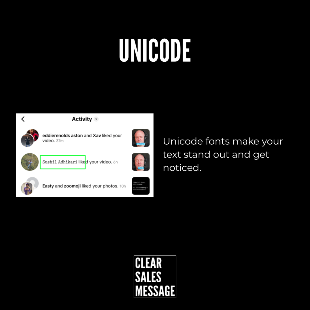
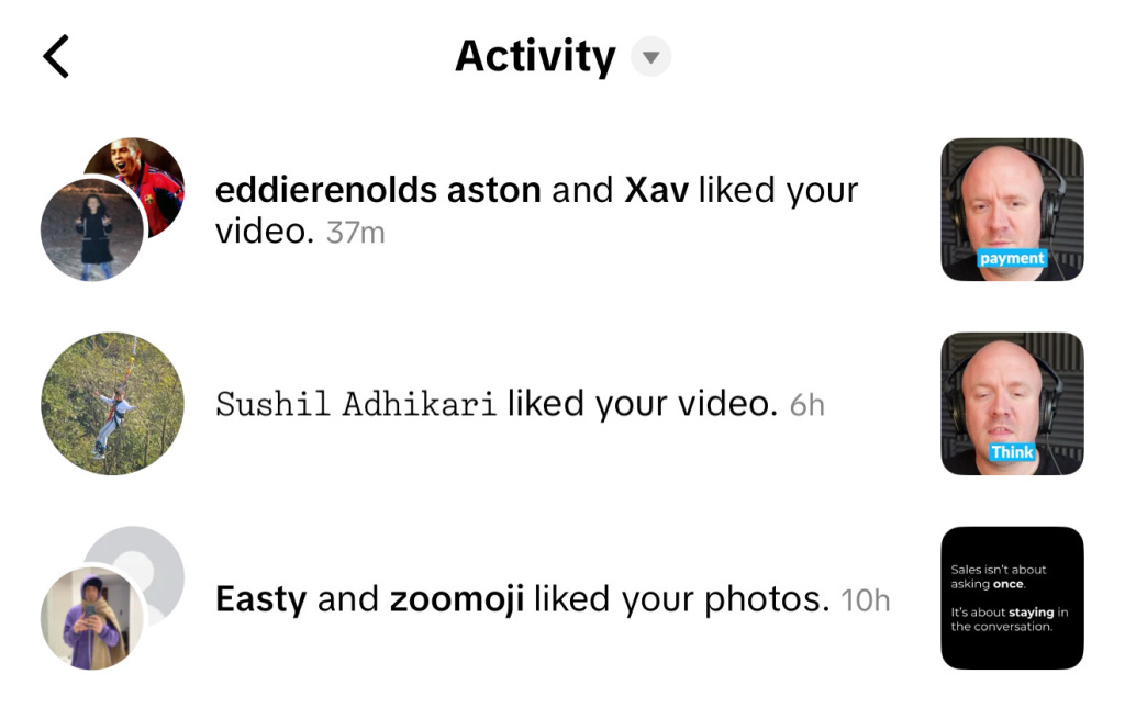
Scrolling through a TikTok activity feed, one account stands out instantly. Every other post uses the same standard font, but this one uses Unicode styling instead. That single difference is enough to make it the one post worth stopping for.
See Also