
Practical Sales Training™ > How To Get Attention > Black and White Effect

Black and White Effect
Colour draws the eye. Black and white pushes it away.
So put yourself in colour, and let everyone else fade into grey.
What Is It
The black and white effect shows you in colour, competitors in grey. So the contrast does the selling for you.
Colour reads as alive. Black and white reads as dull, next to it.
Why Does It Work
It works because contrast changes perception instantly. So something black and white beside something colourful looks less vibrant by comparison.
Black and white can also read as old fashioned. In some cultures, like Japan, black and white photos of people can even suggest they’ve died.
Either way, the comparison isn’t flattering. Since colour makes the difference impossible to miss.
How Can You Use It
There are three solid ways to use this in your own advertising.
Black And White Competitors
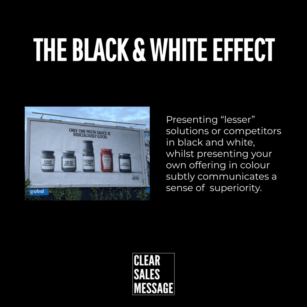
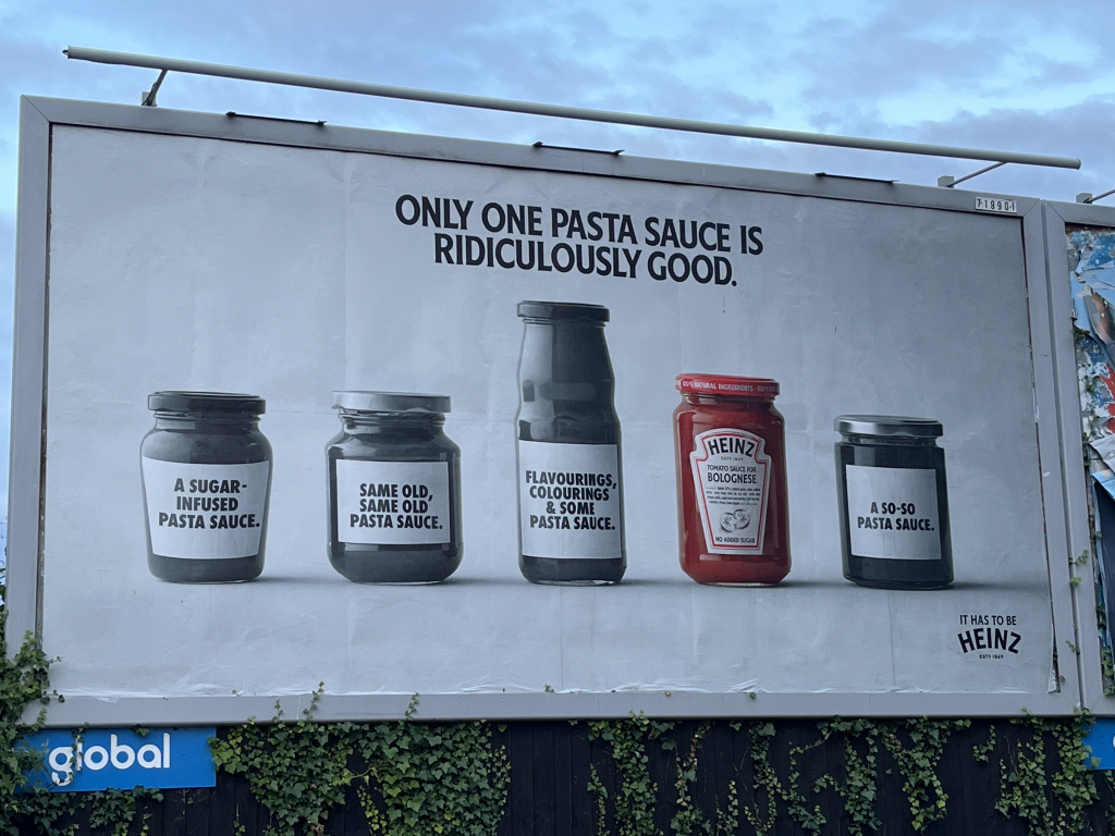
Show yourself in colour and competitors in black and white, just like Heinz. So the visual contrast alone suggests you’re the better choice.
This works even without naming anyone directly. Since the greyscale jar does the talking on its own.
Black And White Results
Show your results in colour and the competition’s results in black and white. So instead of comparing products, you compare outcomes.
This works well with data, charts or before and after shots. Since numbers in colour feel more convincing than numbers in grey.
Black And White Before/After
Show the current problem or old reality in black and white, then your solution in colour. So the shift itself becomes the argument.
This works especially well in before and after formats. Since the contrast mirrors the transformation you’re actually selling.
When It Works Best
This works best in side by side formats, like print ads or comparison pages. So the contrast needs to be seen at a glance to land.
It also helps when you genuinely have a stronger result to show. Since the trick only works if the substance backs it up.
When It Becomes Dangerous
It becomes dangerous if it starts to look unfair or petty. So a heavy handed comparison can make you look insecure instead of confident.
It also backfires if your own offer doesn’t actually hold up. Since buyers who look closer will notice the gap between trick and product.
Common Mistakes
Using It Without A Real Edge
Some businesses use this trick without a real edge to show. So the colour contrast promises more than the product delivers.
Making The Comparison Feel Aggressive
Some make the comparison feel aggressive rather than confident. So competitors and buyers both read it as unfair instead of clever.
Overusing It Until It Loses Impact
Some use it on every single advert. So the novelty fades, and the contrast stops earning any attention at all.
Black and White Effect – An Example
Heinz Pasta Sauce
In this advert, Heinz compare their pasta sauce to the leading brands. So the sauce stands out simply by being the only jar in colour.
See also:
- The Von Restorff Effect
- Crossed out words
- 100+ ways to seize buyer attention
- 100+ ways to be more memorable