
Practical Sales Training™ > How To Get Attention > Picture Letters
Picture Letters: Swap A Letter For An Image That Sticks
Scroll through any feed and watch what your eye actually stops on. It’s rarely a sentence, and almost always a shape, a colour, or something that looks slightly wrong. A word with a picture hiding inside it does exactly that.
So one small substitution can outperform an entire paragraph of copy.
What Is It
This is where you swap a letter inside a word for an image. It borrows from semiotics to seize attention and get the point across. The word still reads correctly. But part of it is now a picture, not text.
Your brand name or tagline is usually the best candidate. That’s the word you most need people to notice and remember.
Why Does It Work
Your brain recognises a simple image faster than it decodes a string of letters. MIT researchers found the brain can identify an image shown for as little as thirteen milliseconds. That’s quicker than reading the word itself. So the picture grabs attention before the sentence around it has even registered.
It also works because a word spelled partly with an image is a little unusual, and unusual things get noticed. Once your eye catches the oddity, it can’t help pausing to work out what it’s looking at. So that pause is the whole point.
How Can You Use It
Pick One Word To Work With
Take just one word from the message you’re trying to convey. Often it’s your brand name. Sometimes it’s your tagline. Resist the urge to picture-fy more than one word. That turns a clever detail into a puzzle nobody wants to solve.
Choose An Image That Carries The Meaning
The image you pick needs to represent the actual concept behind the word, not just fill a gap. But a random shape that happens to look like a letter adds nothing. An image that carries meaning does two jobs at once.
Match The Shape Of The Letter It Replaces
The image also needs to resemble the letter it’s standing in for, closely enough that the word still reads instantly. If a reader has to guess the letter, you’ve traded clarity for a gimmick. Get the shape right and the word reads itself.
When It Works Best
This works best on short, punchy words with one clear substitution. Think loop, eye, or arrow. It also works best when your buyer is scrolling fast. An unusual shape earns a second look exactly then.
So it’s strongest on brand names and taglines you’ll repeat constantly. That investment in getting the image right pays off every time the word appears.
When It Becomes Dangerous
It becomes dangerous once the word stops being readable at a glance. If your buyer has to stare at the logo, something’s gone wrong. So you’ve lost the very thing you were trying to gain: instant recognition. Attention that curdles into confusion still doesn’t convert.
It’s also risky across small sizes and low resolution screens. But an image that reads clearly on a poster can turn into an unreadable smudge on a phone.
Common Mistakes
Choosing An Image That Doesn’t Match The Letter Shape
A picture that only loosely resembles the letter forces the reader to decode the word instead of reading it. The whole technique falls apart if people can’t tell what the word actually says.
Substituting More Than One Letter
One picture letter is a detail. Three is a rebus puzzle. Once you stack multiple substitutions into a single word, most readers give up before they finish decoding it.
Choosing Cleverness Over Clarity
Some image swaps are technically clever. But they mean nothing outside the room where the team dreamed them up. If the image doesn’t carry real meaning connected to the word, it’s decoration, not communication.
Picture Letters – An Example
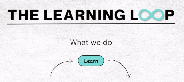
The Infinity Loop
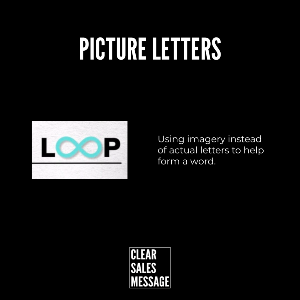
In this example, the infinity symbol replaces the “oo” in “loop.” That single swap does two jobs at once. It looks like the double letter it’s replacing, so the word still reads as “loop” instantly. But it also communicates the infinite, ongoing nature of a loop, which the letters alone never could.
That’s the whole technique in one word. Clever stuff.
See Also