

Practical Sales Training™ > How People Work > WYSIWYG
WYSIWYG
What Is It
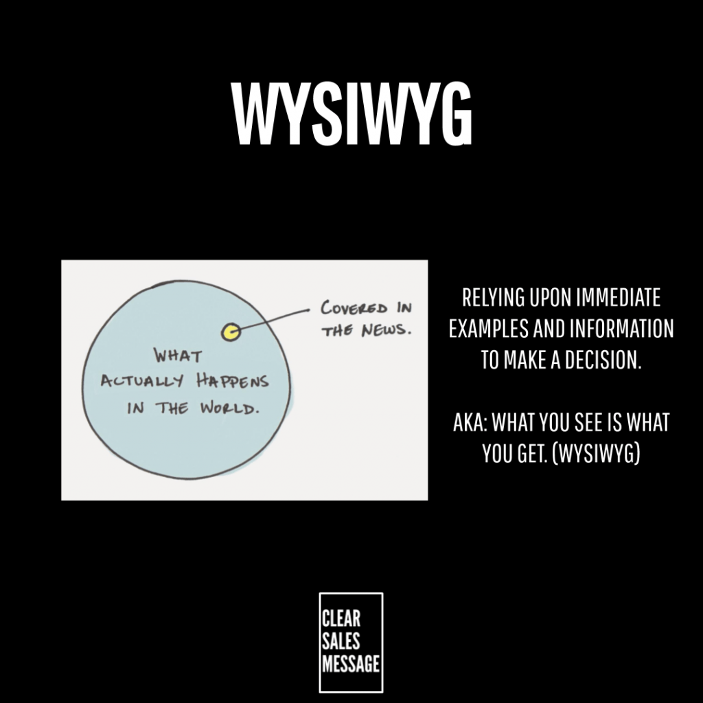
WYSIWYG looks at the fact that we can only process the information we’re presented with.
So a buyer can’t fill in a gap you never mentioned. If you leave something out, it simply doesn’t exist to them.
That’s the entire principle, in one sentence.
Why Does It Work
If you fail to educate your clients about your products, they may not decide at all. The same is true if you fail to give them enough information.
If you don’t tell them, they won’t know.
There’s no assumption of common sense filling the gap. A buyer only has what’s in front of them.
How Can You Use It
Are you presenting all the information you need to handle your clients’ questions and enquiries? Could you share more information, an FAQ, or proof of success stories, so clients can make a more informed decision?
When It Works Best
This works best on pages where a buyer is genuinely trying to decide. A landing page or product description needs to answer the real questions, not just describe features vaguely.
It also works best when you think from the buyer’s side, not your own. What looks obvious to you may be invisible to someone seeing it for the first time.
When It Becomes Dangerous
It backfires if you assume information is obvious when it isn’t. A buyer who can’t find an answer usually leaves rather than searches harder.
It also becomes risky if you provide too much information at once. That buries the key facts under detail nobody asked for.
Vague, generic copy causes its own damage too. It reads as confident to you, but leaves buyers with nothing solid to actually evaluate.
Common Mistakes
Assuming buyers already understand your offering
Assuming buyers already understand your offering skips the exact explanation they actually need.
Writing vague, generic copy
Writing vague, generic copy instead of specific detail leaves buyers with nothing concrete to judge you on.
Burying key information
Burying key information under too much unrelated detail means buyers miss the one fact that would have convinced them.
WYSIWYG – An Example
A Productivity Tool’s Vague Homepage
Hypothetical Example: A software company launches a new productivity tool, but their website only includes a short, vague description:
“We help teams work better together.”
Potential buyers visit the site but don’t understand how it works. They also don’t know what features it has, or why it’s different from competitors. With so little information, they leave without signing up, simply because they can’t make an informed decision.
To fix this, the company updates its site with:
- A feature breakdown (with screenshots and a demo video).
- Case studies showing how real teams saved hours each week.
- An FAQ section answering common concerns.
Now, when visitors arrive, they have everything they need to evaluate the tool, no guesswork required.
See also